Data Visualization
The Story
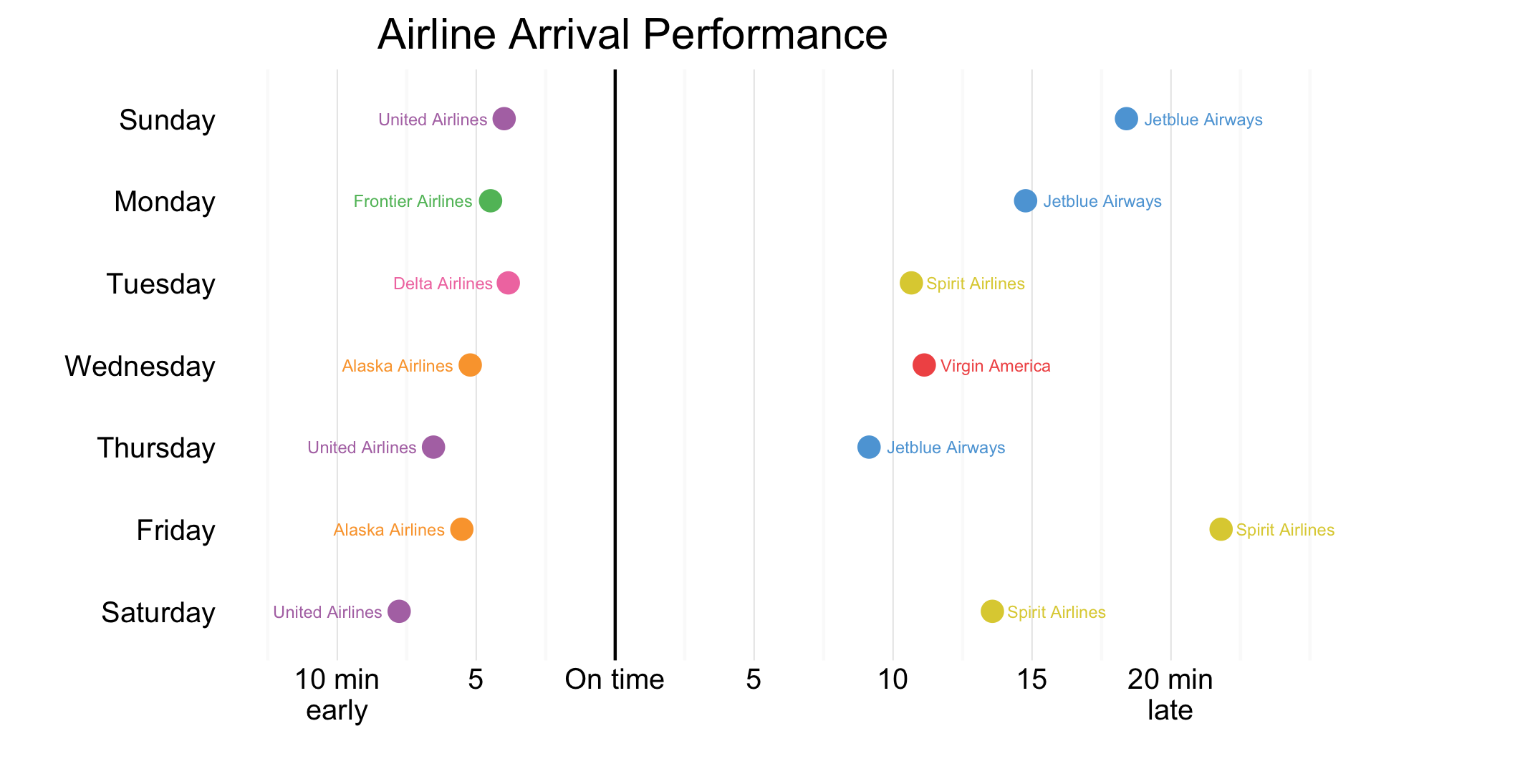
One of the key measures of airline performance is whether they are able to get their passengers to their destination on time. Many airline passengers, especially those with connecting flights, can find it very iterating when a flight is delayed, especially if it more than 15 minutes. Inversely, to arrive at a destination early is rarely complained over, as it means someone can put the travel behind and focus on their destination. If you are a traveller who is particularly familiar with these feelings, perhaps the above visualization can provide guidance when booking flights. For each day of the week, we have calculated the average arrival time (in reference to the schedule) of major carriers in the United States. The best and worst performing airlines for each day are shown above. From this graph we can see scheduling tight connecting flights with Spirit Airlines on a friday may not be a great choice (unless you count one the outgoing plane to leave late).
However, to look at the graph more broadly, we can see that it is uncommon for flights to arrive horribly late, with the lasted average arrival time being less than 25 minutes after a scheduled arrival. We can also see, flights do not tend to arrive early, with no carrier bringing passengers in more than 10 minutes before their scheduled arrival. Perhaps its best to book sufficient layovers and remember that travel should be enjoyable as well.
The Reflection
Overall, I am pleased with graph, having created many iterations for it. I am pleased with my decision to focus on day specific arrival performances. I believe the information presented here is both interesting and pertinent to consumers. I was also pleased that I was able to implement conditional labelling in this graph to change the justification of arrival and delay text.
While I like the graph overall, I do have concerns with it. First, I am unsure whether this information should have been presented on two separate graphs (One for early arrivals, and one for delayed arrivals). I am wrestling with whether the integration of having both on one graph outweighs the increased clarity of splitting it. While I am still undecided about this graph, I am definitely pleased with how it turned out.
Further, due to limitations in the data download, this graph only contains data from January of 2016. If I were to further iterated this visualization I would attempt to download more than one month of data (which would involve multiple downloads and data frame merges). I believe this would show a more accurate story. Further, I would be curious to see if airlines perform differently under different conditions (For example, perhaps JetBlue and Spirit only perform poorly when it is cold).
The Process
The data from this visualization was gathered from the United States Transportation Department’s Bureau of Transportation Statistics database library. This particular database housed the on-time performance for US airline carriers1. I was able to choose the statistics I was interested in looking at (DayOfWeek, UniqueCarrier, and ArrDelay) and download this dataset for a month of my choice. I chose to download data from January 2016. Once I had this data downloaded I was able to begin cleaning it up.
I began by renaming variables so they were easier to understand and work with. Then, I filtered out flights which had “NA” values for their delay times. After this, I was able to calculate the mean arrival performance for each airline by day of the week and then find the best and worst performing airline for each day. To finish off the data preparation I made sure airline names were included rather than their carrier ids and the weekdays factor was in an appropriate order for display.
Once the data was prepared I was able to create the visualization. I chose to use a Cleveland dot plot to represent this data, as I wanted to allow for accurate comparisons between values. I also chose to present this as a horizontal dot plot, to have the x-axis (arrival time) displayed in an intuitive manner. I considered using segments to connect the points to the y-axis, but upon review felt this seemed to connect the max and min on each day, a problem for readers trying to understand the visualization. Other design decisions included colours and the removal of axis titles and grid lines.
The Learning
I found that I spent a lot of time thinking about this graph and the design decisions I was considering. I thought about which colours would be most appropriate, given many of these airlines have company colours. I thought about how to label the axis in an intuitive way so readers would understand the message I was communicating. And I thought about whether this information should be presented on one or two graphs separately. During the process, as well as after I created this graph, I considered many different aspects of visualization design and communication. I made sure to consider how these decisions may work together effectively, to create a piece which communicated an interesting message clearly. I believe this thought process is an important indication of my understanding of multiple important design decisions and how they interact to create a final visualization.
library(foreign)
library(dplyr)
library(ggplot2)

ontime <- read.csv("/Users/.../754684233_T_ONTIME_Weekday.csv")

weekday <- ontime %>%
  rename(Airline = UNIQUE_CARRIER) %>%
  rename(Delay_Zero = ARR_DELAY_NEW) %>%
  rename(Delay_Neg = ARR_DELAY) %>%
  filter(!(is.na(Delay_Zero) | is.na(Delay_Neg))) %>%
  select(Airline, DAY_OF_WEEK, Delay_Zero, Delay_Neg) %>%
  group_by(Airline, DAY_OF_WEEK) %>%
  summarise(mean_delay = mean(Delay_Neg)) %>%
  mutate(DAY_OF_WEEK = c("Monday", "Tuesday", "Wednesday", "Thursday",
                         "Friday", "Saturday", "Sunday")) %>%
  group_by(DAY_OF_WEEK) %>%
  filter(mean_delay == max(mean_delay) | mean_delay == (min(mean_delay))) %>%
  mutate(Airline = gsub("UA", "United Airlines", Airline)) %>%
  mutate(Airline = gsub("F9", "Frontier Airlines", Airline)) %>%
  mutate(Airline = gsub("DL", "Delta Airlines", Airline)) %>%
  mutate(Airline = gsub("AS", "Alaska Airlines", Airline))%>%
  mutate(Airline = gsub("B6", "Jetblue Airways", Airline))%>%
  mutate(Airline = gsub("NK", "Spirit Airlines", Airline))%>%
  mutate(Airline = gsub("VX", "Virgin America", Airline))


weekday$DAY_OF_WEEK <-
  factor(weekday$DAY_OF_WEEK,
         levels = rev(c("Sunday", "Monday",
                        "Tuesday", "Wednesday",
                        "Thursday", "Friday",
                        "Saturday")))


ggplot(weekday, aes(x=DAY_OF_WEEK,
                    y=mean_delay,
                    colour = Airline)) +
  geom_point(size=3) +
  geom_hline(yintercept=0) +
  geom_text(aes(label = weekday$Airline,
                hjust = ifelse(weekday$mean_delay>0,
                               -0.15, 1.15)), size=2) +
  coord_flip(ylim=c(-12,30)) +
  theme_minimal() +
  ggtitle("Airline Arrival Performance") +
  scale_y_continuous(name = "",
                     breaks = c(-10, -5, 0, 5,
                                10, 15, 20),
                     labels = c("10 min\nearly","5",
                                "On time","5","10",
                                "15","20 min\nlate")) +
  scale_x_discrete(name = "") +
  scale_color_manual(values = c("#FAA43A","#F17CB0",
                                "#60BD68" ,"#5DA5DA",
                                "#DECF3F","#B276B2",
                                "#F15854")) +
  theme(panel.grid.major.y=element_blank(),
        legend.position = "none",
        plot.title = element_text(hjust = 0.2))
Footnotes
-
Bureau of Transportation Statistics. (2016). On-Time Performance [Dataset]. Retrieved from: http://www.transtats.bts.gov/DL_SelectFields.asp?Table_ID=236&DB_Short_Name=On-Time. ↩