Data Visualization
The Story1
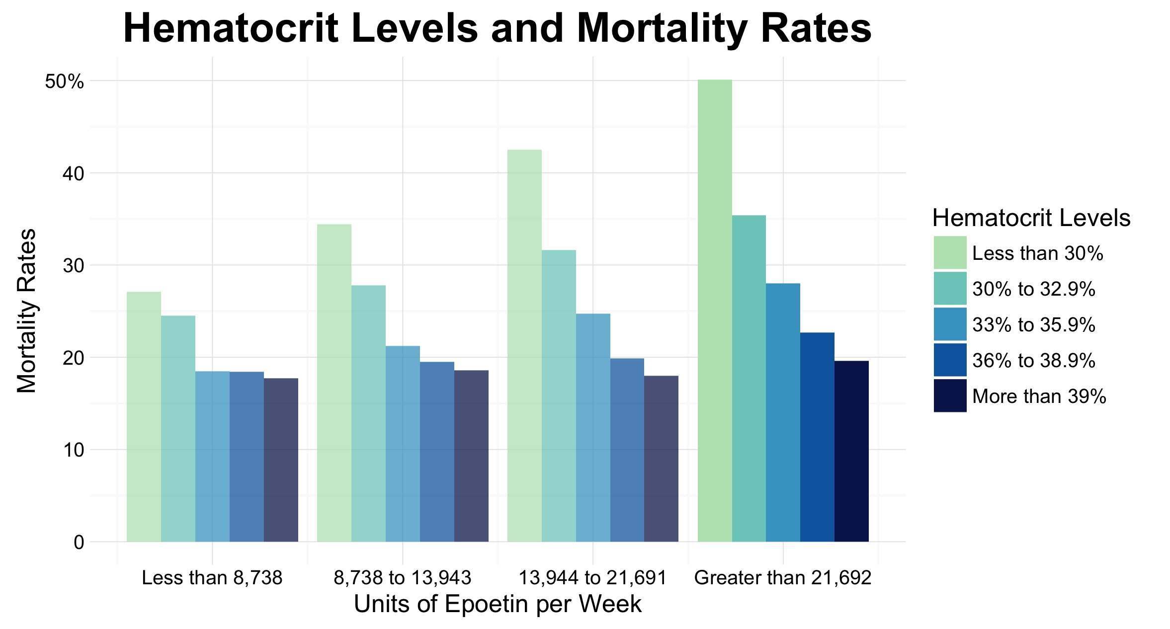
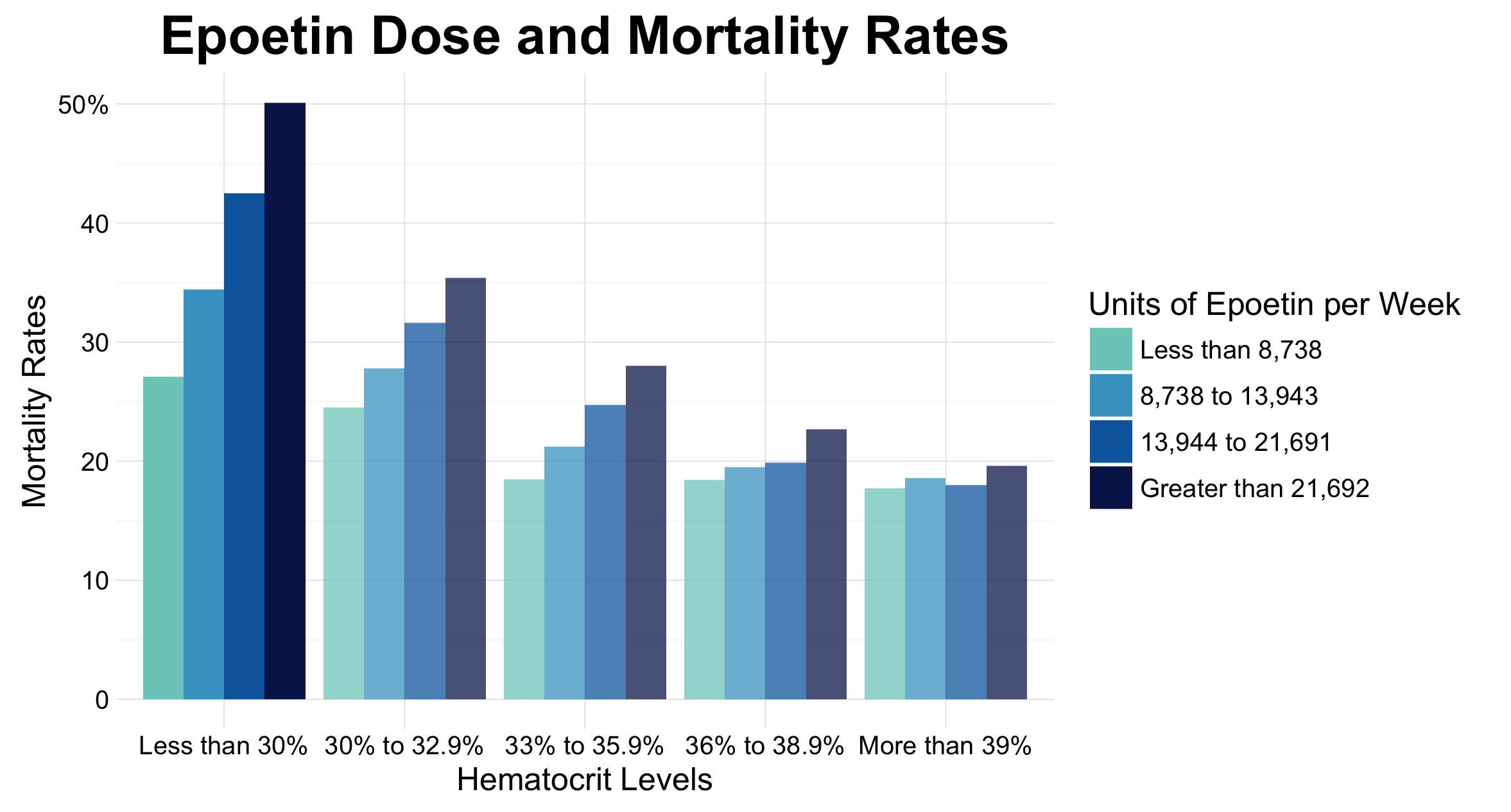
This graph has been created as an improvement over Figure 2 A found on page 1093 of Cotter et. al’s article title on the use of hematocrit as a surrogate end point for epoetin-treated hemodialysis patients. This article was published in the Journal of Clinical Epidemiology, and thus the target audience for the visualization included researchers in the field as well as medical practitioners. Our visualizations show two important findings from the article. As shown in the first graph, there is a trend for mortality rates to decrease, as hematocrit levels increase, especially when patients are receiving more than 21,692 units of epoetin per week. Further, as shown in our second plot, as epotein dose increases, mortality increases. This is particularly apparent in the lowest hematocrit range.
The Reflection
I am quite pleased with the result of these visualizations. I believe it is a huge improvement over the original. My group and I were able to incorporate important lessons into these visualizations, such as understanding when two graphs is better than one, and using colour to highlight certain data. I am happy we were able to find a way to highlight specific bar groups, aligning with the findings and dissuasion presented in the article.
The first thing I would like to reconsider about this graph is the method of highlighting. For this graph, we used alpha values to make certain groupings stand out. However, I would be interested in using another method to highlight this, perhaps something such as different hue strengths for the different bars. Secondly, I would also like to find a way to better present the ranges on the x axis. I played around with multiple notations but was unable to find one which worked well.
The Process
My group and I chose to recreate this graph for our data visualization review, and thus a lot of time was spent working with the message and context before we began plotting the data. Once we had found the article and identified a graph we wanted to improve, we set about trying to understand the old visualization which is shown below. As none of us were experts in the fields of medicine, this involved preliminary research to understand essential topics to the field (Such as what hematocrit is). After we had a rudimentary understanding of the field, we were able to begin reading the article. We were able to identify what the article writers were attempting to convey with their visualization. This knowledge helped inform future design decisions.
Once we understood what our graph should be saying, we began to work with the data and visualizations. We created a csv file using data gleamed from a table in the original article, which we used to develop our plots. Our biggest improvement for this graph was to turn the single 3D plot into two 2D plots. We did this for two reasons. The first is that 3D plots are difficult to read and often result in data being presented in inaccurate ways 2. Thus we decided to avoid the design disaster which is 3D plots, and instead create a simple and clear 2D bar graph. Our second reason was that the original graph was attempting to tell two separate stories. Rather than try to cram all this information into one visualization, we chose to separate them, to facilitate for clear communication of each of the ideas.
Once we had made this decision, it was time to plot our two graphs. Our first graph was focused on showing that first is that as hematocrit increases, mortality decreases, especially in the fourth treatment quartile. To do this we created a dodged bar chart, where bars were grouped by epoetin dose (Quartile). To facilitate in showing the important results of the fourth quartile we chose to make the other bars more transparent. The deeper saturation of these bars allowed them to stand out amongst the rest.
A similar approach was taken with the second graph, which shows how as epoetin dose increases, mortality increases, especially in the lowest hematocrit range. However, for this graph, groupings were made based on hematocrit groups. For each of these graphs, additional design decisions were considered, such as how to effectively display ranges and create clear axis and plot titles.
The Learning
During the creation of the improvement graphs, I began to realize that there is a limit to how much information you try to encode within a single visualization. Upon first seeing the original visualization, and beginning to experiment with how to improve it I believed our group would be able to convey the intended message with a single graph. However, after further examining how the graph was referenced within the article I began to realize the single visualization was intended to capture two stories. Thus, our group decided to use two visualizations to tell these different stories. This was an important decision, as it allowed us to realize there is a limit to what one graph can tell, and that two elegant visualizations are better than one overwhelming visualizations.
library(foreign)
library(dplyr)
library(ggplot2)

art <- read.csv("/Users/.../Plot2data.csv")

artp <- art %>%
  mutate(Mortality.Rates = Mortality.Rates/1000 * 100)


# ***************
# Vis 1 Quartiles
# ***************

# Plotting to show as hematocrit increases, mortality decreases
ggplot(artp, aes(x=Quartile,
                 y=Mortality.Rates,
                 fill = Hematocrit.group)) +
  #Plotting quartiles 1-3 with higher transparency
  geom_bar(data = subset(artp, Quartile < 4),
           stat = "identity",
           position = "dodge",
           alpha = 0.74) +
  #Plotting the fourth quartile with no transparency(highlighting)
  geom_bar(data = subset(artp, Quartile == 4),
           stat = "identity",
           position = "dodge") +
  #Setting colours and legend text
  scale_fill_manual(name = "Hematocrit Levels",
                    values = c("#BAE4BC", "#7BCCC4",
                               "#43A2CA", "#0868AC", "#081D58"),
                    labels = c("Less than 30%",
                               "30% to 32.9%",
                               "33% to 35.9%",
                               "36% to 38.9%",
                               "More than 39%")) +
  theme_minimal() +
  ggtitle("Hematocrit Levels and Mortality Rates") +
  # Setting yaxis text and breaks
  scale_y_continuous(name = "Mortality Rates",
                     breaks = c(0, 10, 20, 30, 40, 50),
                     labels = c("0", "10", "20", "30", "40", "50%")) +
  # Setting xaxis text and breaks
  scale_x_continuous(name = "Units of Epoetin per Week",
                   breaks = c(1,2,3,4),
                   labels = c("Less than 8,738",
                              "8,738 to 13,943",
                              "13,944 to 21,691",
                              "Greater than 21,692")) +
  theme(plot.title = element_text(face="bold", size=20))


# *************
# Vis 2 Epoetin
# *************
ggplot(artp, aes(x=Hematocrit.group,
                 y=Mortality.Rates,
                 fill = factor(Quartile))) +
  geom_bar(data = subset(artp, Hematocrit.group != "[0,30)"),
           stat = "identity",
           position = "dodge",
           alpha = 0.74) +
  geom_bar(data = subset(artp, Hematocrit.group == "[0,30)"),
           stat = "identity",
           position = "dodge") +
  scale_fill_manual(name = "Units of Epoetin per Week",
                    values = c("#7BCCC4", "#43A2CA", "#0868AC", "#081D58"),
                    labels = c("Less than 8,738","8,738 to 13,943",
                              "13,944 to 21,691","Greater than 21,692")) +
  theme_minimal() +
  ggtitle("Epoetin Dose and Mortality Rates") +
  scale_y_continuous(name = "Mortality Rates",
                     breaks = c(0, 10, 20, 30, 40, 50),
                     labels = c("0", "10", "20", "30", "40", "50%")) +
  scale_x_discrete(name = "Hematocrit Levels",
                   labels = c("Less than 30%", "30% to 32.9%",
                               "33% to 35.9%", "36% to 38.9%",
                               "More than 39%")) +
  theme(plot.title = element_text(face="bold", size=20))
Footnotes
-
Cotter, D. J., Stefanik, K., Zhang, Y., Thamer, M., Scharfstein, D., & Kaufman, J. (2004). Hematocrit was not validated as a surrogate end point for survival among epoetin-treated hemodialysis patients. Journal of Clinical Epidemiology, 57(10), 1086-1095 ↩
-
Few, S. (2012). Show Me the Numbers: Designing Tables and Graphs to Enlighten (2nd ed.). USA: Analytics Press. ↩