Data Visualization
The Story
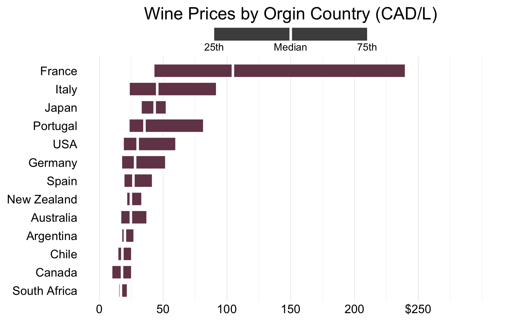
The above graph shows the prices of wine in dependent on a the wine’s country of origin according to data fromopendatabc.ca. These prices are for wines sold in British Columbia Liquor Stores. As we can see, French wines tend to be much more expensive then the wines of any another country, with a median price exceeding $100 per litre.
This raises questions regarding the impact of a country’s “brand” on the price of its wine. Are we willing to pay so much more for French wine, simply because it is French? Or perhaps there are other characteristics which make French wine significantly more expensive than any other wine. This is especially interesting considering wines from countries such as Australia, South Africa, and Spain have recently received international awards1.
An example of the power of branding can be seen in the example of champagne. Champagne is a sparkling wine which is produced from the Champagne region in France following specific production guidelines. While sparkling wine can come from anywhere in the world, champagne must come from this specific region in France, despite the two often being synonymous for consumers. Champagne’s appeal to consumers has given this region of France the ability to sell their sparkling wine for high prices, some topping $1,500 per litre. However, it should be noted France’s red wine is also high priced, with some being priced over $6,000 per litre without touting the champagne brand.
I suppose this should raise questions regarding how we value our wine. Do prices rely heavily on a country’s wine brand? Or are French wine producers able to consistently turn out better wines then the rest of the world? If this is the case, perhaps award winning wine producers from countries such as Australia, South Africa and Spain can begin matching the prices of their French competition.
The Reflection
As this was my first box-plot, I am very happy with how it turned out. I believe this graph presents an interesting story about wine prices and makes for an interesting discussion. I am particularly happy with how the guide for reading the box-plot turned out. I believe this greatly improves the clarity of this graph in a simple way.
One thing I would try to change about this graph is to have the boxes represent a traditional three number summary (minimum, median, maximum), rather than the interquartile range. I was unable to find a way to do this within ggplot2, but would try to dig a little deeper into how I may implement this in the future.
The Process
This graph was produced using the “BC Liquor Store Product Price List”2 made available on opendatabc.ca. This dataset contains the prices of 5,563 products sold in BC Liquor Stores, as well as the characteristics of the products. These characteristics included category (ie. Wine, Spirit, Beer), alcohol content, and origin country.
Once I had acquired this dataset, I was able to begin exploring it. I soon found this dataset listed over 3,500 wines, originating from a wide variety of countries. I was intrigued by this and decided to compare the prices of wine based on their origin country.
To begin, I needed to find the price per Litre of each wine which was sold. This was done by first finding the number of litres with each sale, by multiplying the number of containers per sale by the number of litres per container. From here, I was able to divide the price of the product by the total litres of wine to get the final price per litre.
After I found the price per litre of wine, I began comparing measures of centrality across countries of origin. I began by simply comparing the means between countries. This showed wines originating in France had an average price/L of almost $300, while all other countries had means below $120. After continuing to explore the raw data, I found these simple means were unable to tell the full story of wine prices. For example, France has a total of nine wines which cost over $3000 per Litre, making their average wine price seem like a bargain. I decided there was perhaps a better story tell using the price distributions rather than a simple mean.
Thus, I decided to create a box-plot to present this data. I soon realized there were multiple countries from which only a few wines originated from. I chose to exclude those countries which supplied fewer than 15 wines to the BC Liquor Stores. This was done in an effort to ensure the distributions were representative of wine industries in these nations, rather than a small group of wines.
When making my box-plot, I chose to exclude the whiskers from the diagram. This was done to ensure I was able to communicate with my audience. As Stephen Few mentions, relatively few members of the public have been taught to read box plots, and thus an effort should be made to ensure their clarity and simplicity3. To address this further, I have chosen to include a box-plot guide with my visualization. This helps ensure readers understand what I have presented, as may serve to teach readers who are unfamiliar with box-plots. Other design decisions, such as removing horizontal gridlines and unnecessary axis titles, have been done in an effort to minimize non-data ink.
The Learning
This graph was my first attempt at creating a box-plot. While I am happy with the final result, I encountered a few unexpected bumps along the way. Initially, I had hoped to include the full range of wine prices, excluding outliers, for each country. This was my goal, as I felt readers were much more likely to understand minimum and maximum, rather than percentiles. However, these are typically encoded using whiskers, a feature I was hoping to remove. Despite looking for alternatives, I was unable to find a way to turn whiskers into extensions of the box. Instead, I opted to include a guide for how to read my box-plots. This helps ensure readers are aware of the statistics I am displaying.
liq <- read.csv("/Users/.../BCLiquorStoreProductPriceListDec2015.csv")

# Preparing the Dataset
# *********************

wine <- liq %>%
  rename(Country = PRODUCT_COUNTRY_ORIGIN_NAME) %>%
  filter(ITEM_CATEGORY_NAME == "Wine") %>%
  mutate(L_per_sale = PRD_CONTAINER_PER_SELL_UNIT*
                      PRODUCT_LITRES_PER_CONTAINER) %>%
  mutate(Price_per_Litre = PRODUCT_PRICE/L_per_sale) %>%
  select(Country, Price_per_Litre) %>%
  mutate(Country = paste(substr(Country,1,1),
                         tolower(substr(Country,2,15)),sep="")) %>%
  mutate(Country = ifelse(Country == "United states o",
                          "USA", Country)) %>%
  mutate(Country = ifelse(Country == "New zealand",
                          "New Zealand", Country)) %>%
  mutate(Country = ifelse(Country == "South africa",
                          "South Africa", Country)) %>%
  group_by(Country) %>%
  mutate(total = n()) %>%
  filter(total >= 15)


# Plotting the Visualization
# **************************

ggplot(wine, aes(x=reorder(Country,Price_per_Litre, FUN=median),
                 y=Price_per_Litre)) +
  labs(title="Wine Prices by Orgin Country (CAD/L)") +
  geom_boxplot(fill = "#744357",
               colour = "white",
               outlier.shape = NA,
               coef = 0) +
  annotate("rect", ymin= -5, ymax=310,
           xmin=13.8, xmax=15.35, fill = "white") +
  theme_minimal() +
  coord_flip(ylim=c(0,300)) +
  annotate("rect", ymin= 90, ymax=210,
           xmin=14.65, xmax=15.35, fill = "grey30") +
  annotate("segment", x=14.65, xend=15.35, y=150, yend=150, color="white", size=1) +
  annotate("text", label="Median", x=14.3,y=150,size=3) +
  annotate("text", label="25th", x=14.3,y=90,size=3) +
  annotate("text", label="75th", x=14.3,y=210,size=3) +
  scale_y_continuous(breaks = c(0,50,100,150,200,250),
                     labels = c("0", "50", "100",
                                "150", "200", "$250")) +
  theme(axis.title.x=element_blank(),
        axis.title.y=element_blank(),
        axis.text.x =element_text(size=10),
        axis.text.y =element_text(size=10),
        panel.grid.major.y=element_blank())
Footnotes:
-
Mercer, C. (2015, June 14). Decanter World Wine Awards 2015: Results revealed [Blog Post]. Retrieved from http://www.decanter.com/decanter-world-wine-awards/dwwa-results-highlights/decanter-world-wine-awards-2015-results-revealed-262881/ ↩
-
Open Data BC. (u.d.). BC Liquor Store Price List [Data set]. Retrieved March 26, 2016 from: https://www.opendatabc.ca/dataset/bc-liquor-store-product-price-list-current-prices ↩
-
Few, S. (2012). Show Me the Numbers: Designing Tables and Graphs to Enlighten (2nd ed.). USA: Analytics Press. ↩