Data Visualization
The Story
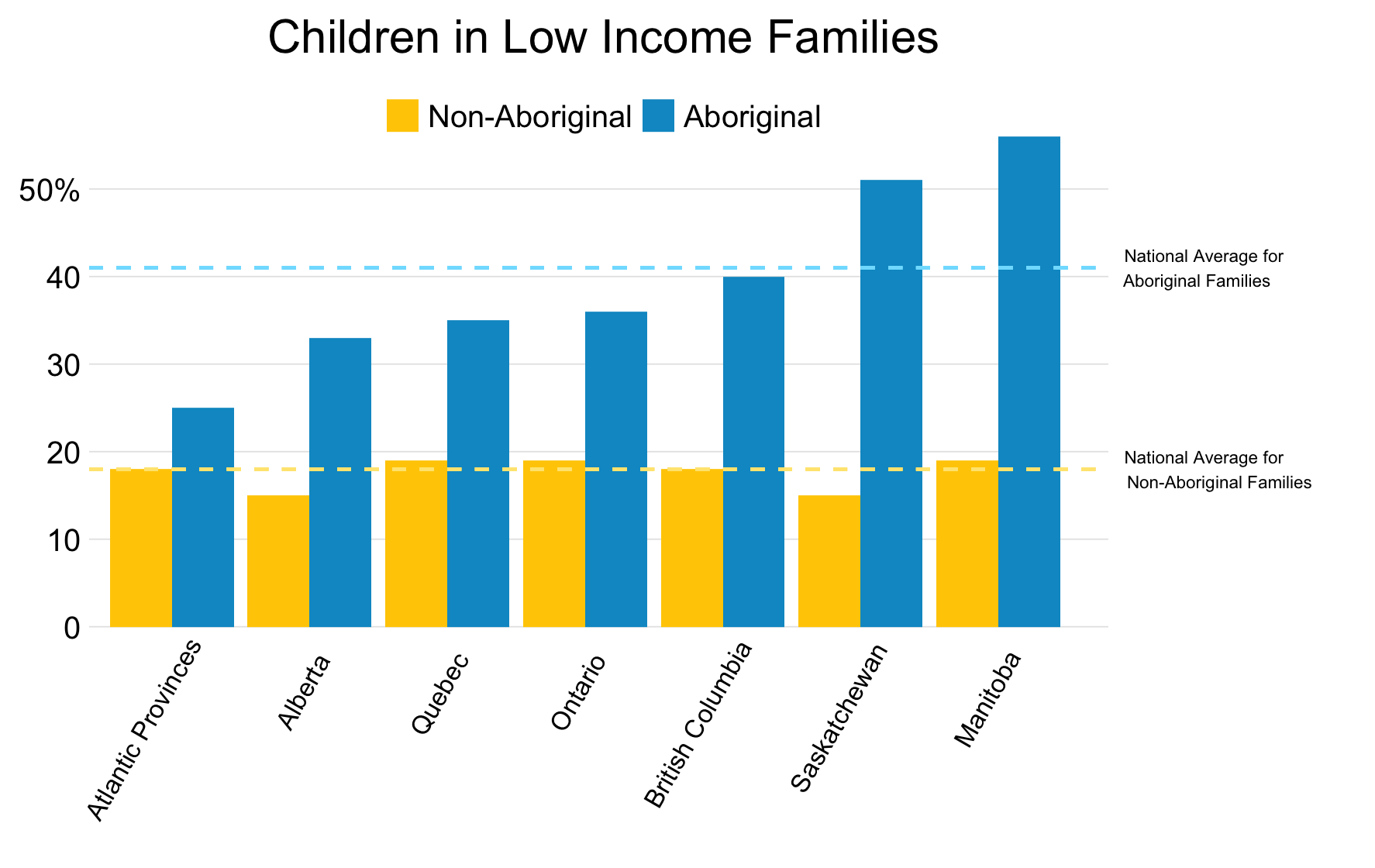
Despite what many would like to believe, child poverty is an issue in Canada. Hundreds of thousands of Canadian children live in low income households[^1]. As shown in the graph above, these statistics become even more concerning when we consider the proportion of aboriginal children who are members of low income families. In Saskatchewan and Manitoba, there is a greater than 50% chance any aboriginal child is a member of a low income family.
This is even more alarming when we consider that these statistics, do not account for children living on reserves, a group which may account for up to 50% of the aboriginal population. And this difference between aboriginal and non-aboriginal children extends across Canada, where aboriginal children are more than twice as likely to be a member of a low income family than their non-aboriginal peers. These figures should raise alarm and concern from Canadians throughout the country. As a population we need to understand and realize a large portion of our children are beginning their lives in vulnerable circumstances. Perhaps, we should begin reevaluating how we are addressing poverty in this nation.
The Reflection
I am happy with how I was able to present this information simply. I believe it conveys a message to readers concerning child poverty rates in Canada. Further, I believe I made an appropriate choice deciding to use reference lines for national averages rather than have a separate set of bars to present this information.
However, I am still not content with how the reference lines appear in this graph. I would have preferred to find a solution where the reference lines corresponded with the bar colours, yet did not blend in with the plotted bars. Further, I would like to figure out how to include annotations outside of the plotted area. Currently, I have included text within the plot and then just covered the plot with a white box to simulate out-of-plot annotations.
The Process
The data used to create this visualization was originally published in a Saskatchewan Ministry of Education report on indicators of education in 2010 [^1]. This data presents the percentage of children under the age of 6 who are members of low income families in provinces across Canada. I copied this information and compiled it into a simple csv file. Since I had ensured this data had the appropriate summaries, naming systems, and structure. There was very little data cleaning which needed to occur. I simply needed to reorder the factor levels to ensure they appeared correctly in the plot, and save the values I needed for the reference lines.
Once this simple data preparation was complete, I was able to begin creating a visualization. I chose to use a vertical dodged bar graph, as I wanted to emphasize the disparity between aboriginal and non-aboriginal children, while also highlighting provincial differences. After the basic bar graph was plotted and I had applied theme_minimal() to the graph I was able to continue improving features such as axis titles, axis breaks, and legend size and position. I also added two reference lines to the graph, to indicate national averages for both non-aboriginal and aboriginal children. To accommodate the labelling of these reference lines I added a white box, to make it seem as though the annotation was being placed outside the plot area. After this was implemented I finalized the graph by choosing appropriate colours for the bars and reference lines.
The Learning
Originally, this data had included a “All Provinces” row which had its own value for both Aboriginal and Non-Aboriginal families. Thus, these values had appeared as their own bars within the plot. However, this meant that many viewers completely missed seeing the national averages, as they were presented alongside province specific measures.
I decided to instead extract this data and present it as two reference lines. While I have used reference lines previously, I have usually manually calculated or chose values to use and encode in the reference line’s specifications. For this visualization, I have chosen to instead code the extraction of these values and then store these values as a variable in the program. This was done as I began to realize the benefits and understand the implementation needed to create reproducible work.
This indicates a change in how I developed visualizations. Instead of simply presenting the final image, I realized it was important to be as transparent as possible and refrain from including “magic number” which seemingly appear from thin air.
library(dplyr)
library(ggplot2)
pov <- read.csv("/Users/...")

pov$Status <- factor(pov$Status, levels = c("Non-Aboriginal", "Aboriginal"))

Allprov <- pov %>%
  filter(Province == "All Provinces")
AbAP <- Allprov$Percent[1]
NAbAP <- Allprov$Percent[2]

pov <- pov %>%
  filter(Province != "All Provinces")


ggplot(pov, aes(pov, x=reorder(Province, Percent),
                y=Percent, fill = Status)) +
  geom_bar(stat="identity", position = "dodge") +
  coord_cartesian(xlim=c(1,9)) +
  geom_segment(x = 0, xend=7.9,
               y=NAbAP, yend=NAbAP,
               colour = "#FFE680",
               linetype = "dashed") +
  geom_segment(x = 0, xend=7.9,
               y=AbAP, yend=AbAP,
               colour = "#80DFFF",
               linetype = "dashed") +
  annotate("rect", xmin=7.8, xmax=12,
           ymin=-0.1, ymax=60,
           fill = "white") +
  annotate("text", x=7.8, y=AbAP,
           size=1.9, hjust = -0.1,
           label = "National Average for\nAboriginal Families") +
  annotate("text", x=7.8, y=NAbAP,
           size=1.9, hjust = -0.1,
           label ="National Average for\nNon-Aboriginal Families")+
  labs(title = "Children in Low Income Families") +
  scale_y_continuous(breaks = c(0,10,20,30,40,50),
                     labels = c("0","10","20","30",
                                "40","50%")) +
  theme_minimal() +
  theme(plot.title = element_text(hjust = 0.3),
        axis.title.x=element_blank(),
        axis.title.y=element_blank(),
        axis.text.x =element_text(angle=60,
                                  hjust=0.85,
                                  size = 8),
        legend.title = element_blank(),
        legend.position = c(0.4, 0.93),
        legend.direction = "horizontal",
        legend.key.size = unit(0.4, "cm"),
        panel.grid.minor.y = element_blank(),
        panel.grid.major.x = element_blank()) +
  scale_fill_manual(values = c("#FFCC00","#0099CC"))
####Footnotes
[^1]: Saskatchewan Ministry of Education. (2010). Saskatchewan Education Indicators Report. Retrieved from http://www.education.gov.sk.ca/Default.aspx?DN=e0077584-d08b-424f-a026-f7c9471280f4
[blog post]. Retrieved from http://www.thinkupstream.net/six_things_about_child_poverty_in_sk