Data Visualization
The Story
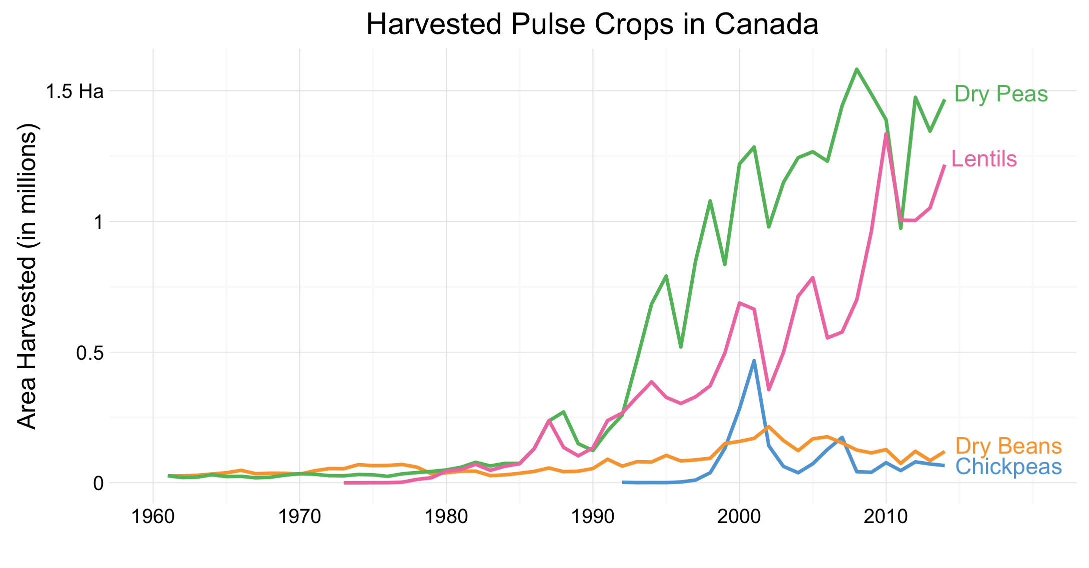
Pulse crops are often considered an important element of a healthy crop rotation in Canada. With our relatively short growing season, Canadian producers are limited in the types of crops which they can produce. In regions of Canada such as the prairie provinces, this means there are few crops which are profitable for farmers to produce. This can lead to shortening of crop rotation in an attempt to increase profits, however this is generally considered as a poor practice as it can easily deplete the soil of important nutrients as well as exacerbate the spread of disease through crop populations.
However, the graph above indicates farmers are continuing to work pulse crops into their rotations. Beginning in the 1990s pulse crops really took off and they are continuing to be grown more widely throughout Canada. Dry peas and Lentils are the most commonly grown pulses, but new varieties and species are pulses are gaining popularity as well. Hopefully, this trend will continue and producers can remain confident in their ability to feasibly produce pulse crops.
The Reflection
I am generally pleased with the result of this graph. I believe I have been able to create a purposeful visualization which contains an appropriate amount of non-data ink. The reduction of non-data ink is important, allowing the data to be the focus of the visualization 1. I am particularly glad I was able to find a way to label the lines rather than include a legend. This tight integration of text with the plot reduces non-data ink, a suggestion made by Stephen Few.
One of the big things I would like to change about this graph is what pulse crops have been included. I chose to use only those crops which were featured in a recent StatsCanada article, “Pulses in Canada”2. Upon reflection of this graph, I have realized there may be some important pulse crops which were not included in this graph, nor the data. For instance, Faba Beans are becoming a very popular crop in provinces such as Saskatchewan, quickly replacing dry pea production in these ares. This change is significant and may provide interesting discussion pieces.
The Process
The first step in the creation of this graph was finding and downloading the pertinent dataset. I used a production dataset downloaded from the Food and Agriculture Organization of the United Nations3. This dataset included country production statistics for over 150 crops dating back to the 1960s. This dataset, and others, can be downloaded on FAO’s website.
Once I had acquired this dataset I was able to begin finding the story I wanted to tell. I began by filtering the dataset to only include Canadian data. From here, I began exploring the production statistics of crops I was most familiar with, and thus could create and understand a story about. After trying crop groups such as cereals and oilseeds, I decided to continue working with pulses. I chose to include Chickpeas, dry peas, dry beans, and lentils in this visualization, as these were identified as important pulses in Canada in a recent Stats Canada article2.
After I had chosen the crop group, I needed to decide whether I would use the ‘Area harvested’, ‘Production Quantity’, or ‘Yield’ statistics. After investigating literature, and thinking about what story I wanted to tell, I chose to use the ‘Area harvested’ statistic. This was because, I believe the number of hectares harvested in a year is able to show changing producer attitudes towards growing these crops, without being greatly affected by year-to-year variation in conditions, or improvements to yield.
To prepare this graph for plotting, I needed to first do some serious data cleaning. This dataset was originally a very wide dataset, meaning it had many columns and very few rows. This is problematic as it had multiple observations contained within each row. I used the melt() function in the reshape2 package available in R. Further data cleaning procedures included the removal of rows meant to contain keys and notes, and changing the format of the Year field to contain numeric years.
After the data was ready to plot, I began to develop a line graph. Since this was a time series where I wanted to provide discussion surrounding the trends, I knew from the beginning I wanted this to be a line plot. After creating a standard line graph, I applied theme_minimal() and then began adding other important elements. I used the aes() field in conjunction with a ifelse statement to ensure crop labels would only appear at the right-most end of the line. Once this was done, I removed the legend. This helps create tight integration with the plot, and helps remove non-data ink 1. Other design choices were also implemented, such as colour choice and labelling of the axes.
The Learning
The data for this visualization came from the FAO data portal, and originally was not tidy data. As we discussed early in the course, tidy data is important for data analysis and can drastically reduce time spent preparing data4. Working with this dataset emphasized the importance of creating tidy data. It also had me learn how to use Hadley Wickham’s reshape2 R package to tidy up the messy data.
Originally this was a very ‘wide’ dataset, with each year of collected data taking up two columns of the data set. To tidy this up, I was able to use reshape2’s melt function and convert it to a ‘long’ data set rather than a wide dataset. Using this function, along with further manipulation of variables and removal of irrelevant columns, I was able to turn the rather messy original dataset to a relatively tidy one. After learning how to use melt here, I have been confident to tackle more messy datasets, extracting interesting information efficiently. Further, this experience has taught me the importance of creating tidy datasets, while informing that real world data is not tidy.
# The Set Up

library(foreign)
library(dplyr)
library(ggplot2)
library(igraph)
library(reshape2)


fao <- read.csv("/Users/.../Production_Crops_E_Americas_1.csv")

# The Data
area <- fao %>%
  filter(Country == "Canada") %>%
  filter(Item == "Chick peas" |
           Item=="Peas, dry" |
           Item == "Beans, dry" |
           Item == "Lentils") %>%
  filter(Element == "Area harvested") %>%
  melt(id.vars = c("Country.Code", "Country", "Item.Code",
                   "Item", "Element.Code", "Element", "Unit")) %>%
  select(Item,variable, value) %>%
  rename(Year = variable) %>%
  rename(Area = value) %>%
  filter(Area != "" &
           Area != "*" &
           Area != "F" &
           Area != "M" &
           Area != "Im" &
           !is.na(Area)) %>%
  mutate(Year = as.numeric(substr(Year, 2, 5))) %>%
  mutate(Area = as.numeric(Area)) %>%
  mutate(Item = gsub("Peas, dry", "Dry Peas", Item))%>%
  mutate(Item = gsub("Beans, dry", "Dry Beans", Item))%>%
  mutate(Item = gsub("Chick peas", "Chickpeas", Item))


# The Plot
ggplot(area, aes(x=Year, y=Area, colour=Item)) +
  geom_line(size = 0.8) +
  geom_text(aes(label=ifelse(Year==2014,as.character(Item), ""),
                vjust=ifelse(Item=="Chickpeas", 0.5 ,0.1)),
            hjust=-0.1) +
  theme_minimal() +
  ggtitle("Harvested Pulse Crops in Canada") +
  scale_y_continuous(name="Area Harvested (in millions)",
                     breaks = c(0, 500000, 1000000, 1500000),
                     labels = c(0, 0.5, 1, "1.5 Ha")) +
  scale_x_continuous(name="",
                     breaks = c(1960, 1970, 1980, 1990, 2000, 2010)) +
  scale_colour_manual(values=c("#5DA5DA","#FAA43A",
                               "#60BD68","#F17CB0")) +
  guides(colour = FALSE) +
  coord_cartesian(xlim=c(1960,2020))
Footnotes
-
Few, S. (2012). Show Me the Numbers: Designing Tables and Graphs to Enlighten (2nd ed.). USA: Analytics Press. ↩ ↩2
-
Bekkering, E. (2014). Pulses in Canada. Ottawa: Statistics Canada. Retrieved from http://www.statcan.gc.ca/pub/96-325-x/2014001/mi-rs-eng.htm ↩ ↩2
-
Food and Agriculture Organization of the United Nations. (2015). Crop Production. [Dataset]. Retrieved from http://faostat3.fao.org/download/Q/QC/E ↩
-
Wickham, Hadley. 2014. “Tidy Data.” Journal of Statistical Software. ↩