Data Visualization
The Story
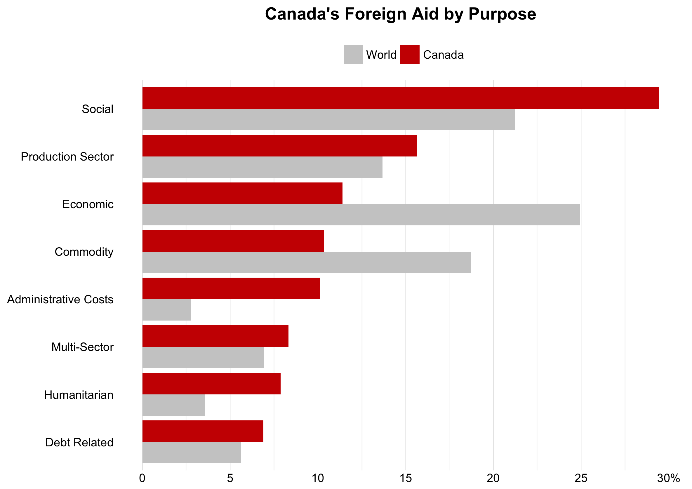
Since 1980, Canada has donated over 67 billion dollars to nations throughout the world in the form of foreign aid. These donations often go towards developing nations or to provide aid following catastrophe. However, what causes does our nation choose to provide the most money to? As shown in the above graph, Canada provides the most foreign aid to social causes, which includes education, health, water supply and sanitation initiatives1. Just under 30% of all foreign aid Canada provides, is contributed to this sector. This is over 5% more than the relative amount the global community contributes to these same causes. Other sectors which we provide a relative large amount of money to are humanitarian and administrative costs. On the other hand, we contribute relatively little foreign to the economic and commodity sectors. Do these difference indicate Canadian values in comparison to the rest of the world’s foreign aid providers? Alternatively, perhaps other nations contribute foreign aid in a similar fashion as we do, but global averages are altered by non-nation donors such as the United Nations and other global organizations.
The Reflection
Overall, I am pleased with how this visualization turned out. I think it shows an interesting comparison between Canada and the global community. I believe this comparison presents information making for an interesting discussion surrounding foreign aid and the values of different donor groups. Further, I am happy with my decision to plot this data as two dodged bars, with one representing Canada and the second representing the world. Preliminary graphs only a bar for Canada which showed Canada’s comparison to the rest of the world. In these initial graphs the social bar would have been positive, while the economic bar would have been negative. I believe my choice to use dodged bars is much more intuitive and clear.
However, I have been try to think of ways which the purpose labels could be more informative. Currently, the visualization depends on accompanying text to explain what kinds of aid fall into each purpose category. While I believe accompanying text is very important for visualizations, I would be interested in finding an elegant way to communicate this information within the graph.
The Process
I downloaded the dataset for this visualization from aiddata.org. This is dataset contains over 1 million foreign aid transactions, funded by over 80 donors dating between the early 1940s and 2012 1. I chose to download the “Thin” version, as it provided the necessary information for this visualization.
Once I had downloaded and spent some time exploring the dataset and its documentation, I needed to create my datasets. To do this, I created a dataset for Canada and a dataset for the World. Each followed similar procedures, first I filtered our values to focus on the years 1980 to 2010. I chose to do this because values outside of this range seemed incomplete. Then, I divided the coalesced_purpose_code by 10000 to obtain each donations general purpose (This is used later on). Then, I found the amount donated for each purpose, and compared it to the total amount donated by either Canada or the World by generating a percentage value.
Once each of these datasets were created I merged them. Then, I mapped the summarized purpose codes, I mentioned earlier to their respective meanings using multiple ifelse and mutate pairings. After this was done, I manually ordered the rows within the dataset to produce an order of decreasing Canadian donations. Then I reordered the region factor so Canada would be displayed above World in the plot.
Once the data was prepared, I was able to generate a visualization. I chose to use a dodged bar graph to present this data, as I wanted to allow viewers to easily compare values between Canada and the World. Further, I wanted to be able to make comparisons across purposes to see which we donate to the most. Other changes I made to the default graph included a coordinate-flip, and implementing theme_minimal(). After this, I added a plot title, removed axis titles and all horizontal gridlines, and changed x-axis breaks.
The Learning
In the process of converting this graph from a horizontal bar graph to a vertical bar graph, I found the bars were not appearing in the order I desired. The grey world bars were appearing above the red Canada bars. This was problematic, as I wanted to highlight Canada’s foreign aid, and doing so was more easily done with Canada’s values on top.
I tried multiple methods to order the bars, including manually changing dataset values. I ultimately discovered I needed to change the factor levels in the dataset. This was an important realization, as prior to this I hadn’t been comfortable working with factors within the datasets (instead I was converting them to strings or integers). I have continued to reuse the following code throughout my portfolio graphs, and other visualizations to properly order the bars, without manually adjusting the dataset. This has both improved the reproducibility of my visualized and minimized the time I spend manually manipulating datasets.
facompare1$region <- factor(facompare1$region, levels = c("World", “Canada”))
library(foreign)
library(dplyr)
library(ggplot2)
library(reshape2)

fa <- read.csv("/Users/.../aiddata2-1_thin.csv")

faworld<- fa %>%
  filter(year>=1980 & year<=2010) %>%
  mutate (coalesced_purpose_code =
            floor(coalesced_purpose_code/10000)) %>%
  group_by (coalesced_purpose_code) %>%
  summarize (total_world_mill =
               sum(commitment_amount_usd_constant)/1000000) %>%
  mutate (World = (total_world_mill/sum(total_world_mill)*100)) %>%
  select (coalesced_purpose_code, World)

facan<- fa %>%
  # Filtering to use a specific year range & donor
  filter(year>=1980 & year <= 2010 & donor == "Canada") %>%
  summarize(total = sum(commitment_amount_usd_constant))
  # Change very specific codes to general categories & remove meaningless ones
  mutate (coalesced_purpose_code = floor(coalesced_purpose_code/10000)) %>%
  # Find the total for each purpose category
  group_by (coalesced_purpose_code) %>%
  summarize (total_mill =
               sum(commitment_amount_usd_constant/1000000)) %>%
  mutate (Canada = (total_mill/sum(total_mill)*100)) %>%
  select (coalesced_purpose_code, Canada)

facompare <- merge(facan, faworld, by="coalesced_purpose_code")

facompare1 <- facompare %>%
  # Changing the codes to meaningful categories
  mutate(coalesced_purpose_code =
           ifelse(coalesced_purpose_code == 1,
                  "Social",
                  coalesced_purpose_code)) %>%
  mutate(coalesced_purpose_code =
           ifelse(coalesced_purpose_code == 2,
                  "Economic",
                  coalesced_purpose_code)) %>%
  mutate(coalesced_purpose_code =
           ifelse(coalesced_purpose_code == 3,
                  "Production Sector",
                  coalesced_purpose_code)) %>%
  mutate(coalesced_purpose_code =
           ifelse(coalesced_purpose_code == 4,
                  "Multi-Sector",
                  coalesced_purpose_code)) %>%
  mutate(coalesced_purpose_code =
           ifelse(coalesced_purpose_code == 5,
                  "Commodity",
                  coalesced_purpose_code)) %>%
  mutate(coalesced_purpose_code =
           ifelse(coalesced_purpose_code == 6,
                  "Debt Related",
                  coalesced_purpose_code)) %>%
  mutate(coalesced_purpose_code =
           ifelse(coalesced_purpose_code == 7,
                  "Humanitarian",
                  coalesced_purpose_code)) %>%
  mutate(coalesced_purpose_code =
           ifelse(coalesced_purpose_code == 9,
                  "Administrative Costs",
                  coalesced_purpose_code)) %>%
  mutate(coalesced_purpose_code =
           ifelse(coalesced_purpose_code == 0,
                  "Unspecified",
                  coalesced_purpose_code)) %>%
  melt(id = "coalesced_purpose_code") %>%
  rename(percent = value) %>%
  rename(region = variable) %>%
  mutate(order = c(1,3,2,6,4,8,7,5,1,3,2,6,4,8,7,5))

facompare1$region <- factor(facompare1$region, levels = c("World", "Canada"))


ggplot(facompare1, aes(x=reorder(coalesced_purpose_code, -order),
                       y=percent,
                       fill = region)) +
  geom_bar(stat="identity", position = "dodge") +
  coord_flip() +
  theme_minimal() +
  ggtitle("Canada's Foreign Aid by Purpose") +
  theme(plot.title = element_text(lineheight=.8,
                                  face="bold", size = 14),
        axis.title = element_blank(),
        panel.grid.major.y = element_blank(),
        panel.grid.minor.y = element_blank(),
        legend.title = element_blank(),
        legend.position = "top") +
  scale_y_continuous(breaks=c(0, 5, 10, 15, 20, 25, 30),
                     labels=c("0","5","10","15","20","25","30%")) +
 # scale_x_discrete(name = "Purpose of Aid") +
  scale_fill_manual(values = c("grey80","#CC0000"))
Footnotes
-
Tierney, Michael J., Daniel L. Nielson, Darren G. Hawkins, J. Timmons Roberts, Michael G. Findley, Ryan M. Powers, Bradley Parks, Sven E. Wilson, and Robert L. Hicks. 2011. More Dollars than Sense: Refining Our Knowledge of Development Finance Using AidData. World Development 39 (11): 1891-1906. ↩ ↩2