Data Visualization
The Story 1
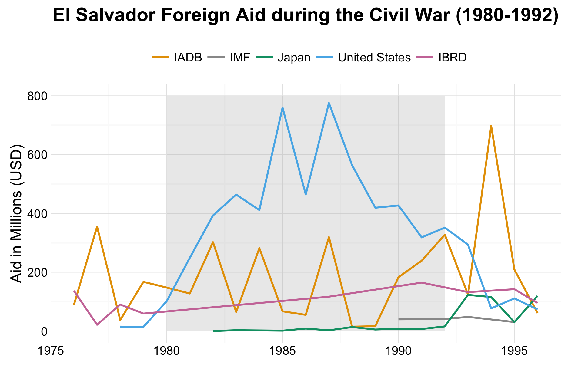
Between the years 1980 and 1992, El Salvador was engaged in a civil war. If we examine the donations from that time, and the surrounding years, we notice most of the aid received by El Salvador during this time was from the United States. This aligns with historical fact, where the United States siding with and financially backing the El Salvador government during the civil war. This graph shows the strong investment, of 5 billion dollars provided by the United States. Other top entities contributed a combined total of almost 2 billion dollars during the civil war. The overwhelming amount of funding from the United States during this time accounted for over 70% of foreign aid during the civil war. From this, one can interpret the amount of support the government of El Salvador received, and how this may influenced their victory in the war.
The Reflection
I am quite pleased with how this graph turned out. I am most happy that we were able to cut out some of the overwhelming data and focus on a time period and donors which highlighted a particular story. I believe this story is interesting to tell, and viewers will enjoy interpreting the graph. Further, I am pleased with our ability to highlight the key section of this graph. I believe it does a great job providing context for the graph. Also, it makes it easy for viewers to project axis values above to compare them to the trend lines.
One aspect of this graph I am not satisfied with, is the method which was used to highlight the civil war. While the annotated box works for our purposes, I would be interested in finding a more elegant way to highlight this time period. Further, I have considered how one might include a reference line of sorts on this graph, perhaps showing the total amount of aid. However, I believe this would dwarf the currently plotted values. Thus, I would like to explore if it would be possible to easily present and communicate a percent change per year in this visualization.
The Process
The data for this visualization was downloaded from aiddata.org 2. I downloaded the “Thin” version of this dataset, as it was sufficient for telling an interesting story.
Once my group and I had obtained this dataset, we began to cut down on the data, based on our interests. We chose to focus on foreign aid received by El Salvador. After this, we began a constant reiteration process, during which we chose to focus on donations made by the top 10 donors during the civil war. Later, we chose to include years immediately preceding and following the civil war, to provide context for our discussion. We also chose to summarize the total donation dollars in millions, rather than in their original values (ie. 2000000 became 2).
Since this graph was developed through a very iterative process, we were constantly generating visualizations to help us understand the and improve our presentation. We began with a simple line graph, as we wanted to show donation trends during the civil war. Then, once we decided to include years surrounding the civil war period, we needed to find a way to indicate when the civil war took place. We believed the axes didn’t provide enough of a guide, especially since the end date was neither a minor nor major gridline. Thus, we chose to use a rectangle annotations to highlight the civil war time period. Other design decisions, such as the removal of an x-axis and legend title were done in an attempt to reduce non-data ink and create a simple visualization.
The Learning
This was my first attempt at producing a polished line graph which attempted to tell an interesting story. The story we wanted to tell was to show how foreign aid to El Salvador changed during and after its civil war. To do this, our group chose to highlight the years of the civil war with a shaded box. This was the first time I made a design decision solely for the purpose of telling a story. Prior to this, design elements were included to provide clarity or encode data for the graph. This was the first time I used a design element solely for the purpose of aiding in the communication of a message. This meant the text accompanying the visualization was able to be closely connected with the graph, making for a more elegant and continuous understanding. This helped me understand the close connection which should be made between a visualization and the story it is meant to tell.
library(foreign)
library(dplyr)
library(ggplot2)

fa <- read.csv("/Users/.../aiddata2-1_thin.csv")

faelswar<- fa %>%
  filter (recipient == "El Salvador" & year < 1997 & year > 1975 &
            (donor == "United States" |
            donor == "Inter-American Development Bank (IADB)" |
            donor == "World Bank - International Bank for Reconstruction and Development (IBRD)" |
            donor == "International Monetary Fund (IMF)" |
            donor == "Japan")) %>%
  group_by (year, donor) %>%
  summarise (total = sum(commitment_amount_usd_constant)/1000000)


ggplot(faelswar, aes(x=year, y=total, colour = donor)) +
  annotate ("rect", xmin = 1980, xmax = 1992,
            ymin = 0, ymax = 800,
            alpha = 0.3, fill = "grey") +
  geom_line(size = 0.7) + theme_minimal() +
  ggtitle("El Salvador Foreign Aid during the Civil War (1980-1992)") +
  theme(plot.title = element_text(lineheight=.8,
                                  face="bold",
                                  size = 15)) +
  theme(legend.position="top") +
  scale_color_manual(name = "",
                     values = c("#E69F00","#999999", "#009E73",
                                "#56B4E9","#CC79A7"),
                     labels=c("IADB", "IMF", "Japan",
                              "United States", "IBRD")) +
  scale_y_continuous(name="Aid in Millions (USD)") +
  scale_x_continuous(name = "")
Footnotes
-
Anderson, J., Clubine, A., MacGowan, E., & Persofsky, B. (2016, March 8). March 07 Data Challenge. INTEG 375. ↩
-
Tierney, Michael J., Daniel L. Nielson, Darren G. Hawkins, J. Timmons Roberts, Michael G. Findley, Ryan M. Powers, Bradley Parks, Sven E. Wilson, and Robert L. Hicks. 2011. More Dollars than Sense: Refining Our Knowledge of Development Finance Using AidData. World Development 39 (11): 1891-1906. ↩