Data Visualization
The Story
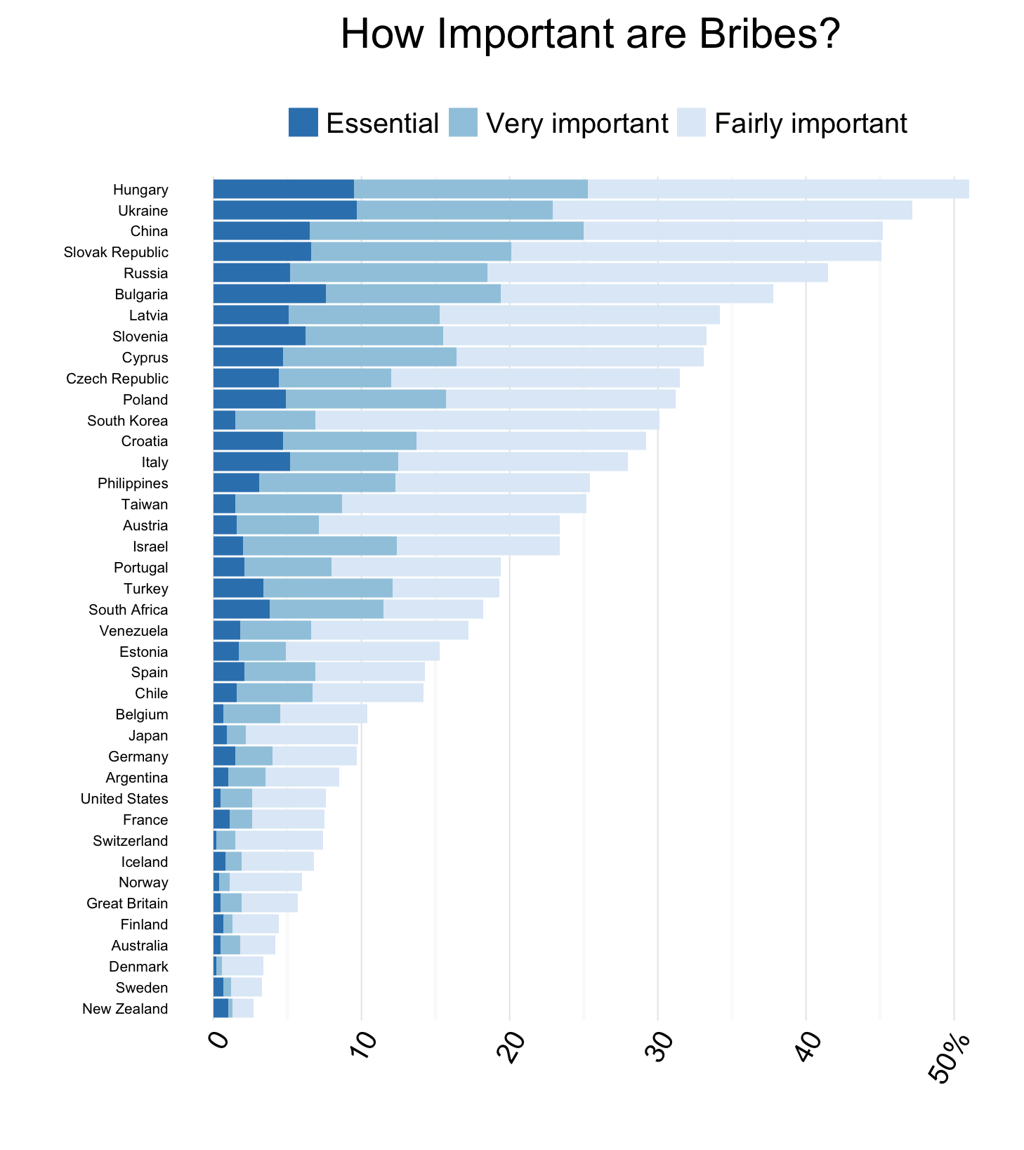
How important is giving bribes to “getting ahead”? This was the question asked of over 55,000 people from 40 different countries in the International Social Survey Programmes 2009 survey on social inequality. Responses varied, with answers ranging from “Essential” to “Not important at all”. Nations such as New Zealand, Sweden, and Denmark had fewer than 5% agree it was important. In contrast, over 50% of respondents from Hungary stated they believed bribes were important to getting ahead. Might a nation’s perceived importance of bribes be a strong indicator of corrupt officials and governments? Another interesting observation from this chart, is that eight of the ten countries who most agree bribes are important are Eastern European nations, many of which were once part of the Soviet Union. This aligns well with the fact that past events in these regions (as recent as 2015) have indicated high levels of corruption dominate these once communist nations.
The Reflection
Overall, I am very happy with this graph, especially considering it was done so early on in the course. I think this visualization presents information which allows for interesting discussions in accompanying text or amongst viewers. Initially I considered making this a dodged bar graph or facet wrap the plot by answer. However, I feel this works well, as I have presented a comparison between nations of the percentage of people who believe bribes are important to success. I believe this graph is able to achieve this goal, while also presenting the secondary message regarding how many people strongly agree.
One change I would like to make with this graph is to move the country names closer to the axis, while still having them right aligned. While this is a minor quip with the plot, I believe these labels are disconnected from the rest of the graph, making it more difficult to read and understand. Further, I am torn as to whether I should have only included a portion of these countries. While I believe the current presentation is very busy, I also believe there is an important discussion around why countries such as New Zealand and Sweden have so few people believe bribes are important.
The Process
As this was one of the first graphs I made for this class, much of the process was spent understanding the data and software I was using. The dataset for this visualization was collected by the International Social Survey Programme’s 2009 Social Inequality Survey1. Once I had downloaded this dataset, I was able to begin exploring it and soon was interested in the differences between countries regarding answers to questions regarding the importance of bribes and corruption.
Without doing much data preparation, I began to plot the number of respondents from each country who believed giving bribes was important or essential to success. I then chose to normalize this by finding the percentage of respondents from each country who believed this. This conversion to a percentage required a bit more work with the data. This provided me with an interesting distribution, with values ranging from less than 5% to greater than 50%. I then chose to use a fill colour to distinguish between those who strongly or moderately agreed bribes were important. I also chose to display country names rather than codes, to improve clarity for readers.
The Learning
This was the first finalized graph which I made in R studio. It was during the completion of this graph where I established the base skills needed to create graphs using ggplot2. Further, this was my first interaction with publicly available datasets. Overall, my lack of familiarity with the software and open data meant I learned many valuable skills developing this graph.
Basic skills such as how to mutate, summarize, and generally manipulate data were first learned developing this graph. For example, one of the major obstacles to creating this graph was figuring out how to find percentages rather than respondents. To do this, I spent a lot of time walking through documentation and stack overflow comments to conceptually understand each of the commands. Through the creation of this graph, I was able to understand how and when to use functions within dplyr to ease in data wrangling. These lessons were later applied to perform more complex data operations.
Further, by developing this graph I was able to understand the basics of ggplot2’s syntax. Prior to this graph, I had been finding pre-made code chunks to use within my plot functions. However, with this graph I was able to gain the knowledge and confidence to write the code from scratch, understanding the form and reasoning behind the ggplot() function. This was an important milestone for my understanding and learning within RStudio, giving me the knowledge I needed to continue creating novel visualizations.
library(foreign)
library(dplyr)
library(ggplot2)

issp <- read.dta("/Users/.../ZA5400_v3-0-0.dta")

isspb <- issp %>%
  select(V5, V13) %>%
  rename(important_bribes = V13) %>%
  rename(Country  = V5) %>%
  # Removing the country code in the form (__-)
  mutate(Country = substring (Country, 4)) %>%
  # Great Britian is a special case
  mutate(Country = gsub("GBN-Great Britain and/or United Kingdom", "Great Britain", Country)) %>%
  group_by(Country, important_bribes) %>%
  summarise (n = n()) %>%
  group_by(Country) %>%
  mutate(perc = round(n/sum(n)*100, 1)) %>%
  filter(important_bribes == "Very important" |
         important_bribes == "Essential" |
         important_bribes ==  "Fairly important")


ggplot(isspb, aes(reorder(Country, perc), perc,
                  fill = important_bribes)) +
  ggtitle("How Important are Bribes?") +
  geom_bar(stat="identity") +
  theme_minimal() +
  scale_fill_manual(name="",
                    values=c("#3683BB", "#A0CAE0", "#DFEBF7")) +
  scale_x_discrete(name="") +
  scale_y_continuous(name="",
                     labels=c(0, 10, 20, 30, 40, "50%")) +
 # guides(fill=guide_legend(reverse=TRUE)) +
  theme(axis.text.x = element_text(angle = 60, hjust = 1),
        axis.text.y = element_text(size=5, hjust=1),
        panel.grid.major.y = element_blank(),
        legend.key.size = unit(0.4, "cm"),
        legend.position = "top") +
  coord_flip()
Footnotes
-
International Social Survey Programme. (2009). Social Inequality IV [Dataset]. Retrieved from: http://zacat.gesis.org/webview/index.jsp?object=http://zacat.gesis.org/obj/fStudy/ZA5400 ↩