Data Visualization
The Story
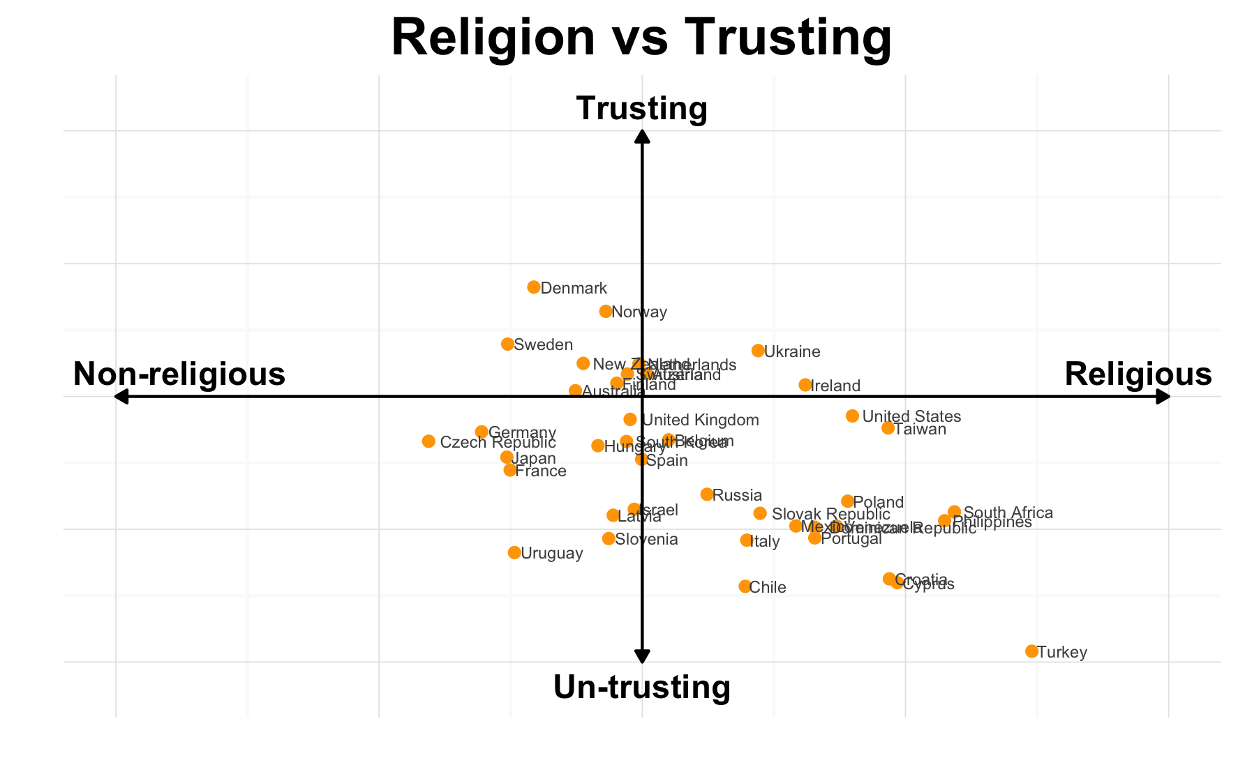
Examining the similarities and differences between countries can extremely insightful. These help shape our cultures, national identities, but may also be indicative of shared experiences or human nature. As shown in the graph above, countries differ in their willingness to trust others, as well as their religiousness. However, we should also note, that no country is extremely trustworthy, nor is any country extremely non-religious. This may indicate a shared global tendency away from these extremes. We can also see many countries fall close to the axes, indicating their moderate stances on at least one of these topics.
However, when we look at this graph it seems to as though countries which tend to be more religious are also those which are least trusting. However, if we further consider why this might be, we see other similarities between untrusting countries. For example, many of the distrusting countries have gone through recent political or social unrest. Perhaps during these times of instability people find solace in their faith, while simultaneously losing trust in others.
The Reflection
Overall, I find this plot to present a very interesting story. I believe I have managed to reduce non-data ink on the page to have the actual data stand out. I am also very happy with my decision to calculate summary statistics for nations rather than use a density plot, or bar graph to show differences between countries.
However, there are also a few things I would like to change. First, I would have liked to find a way to reduce the effect of over plotting on this graph. While very few of the points overlap, the corresponding text does. This makes it difficult to read country names, particularly surrounding the origin of the plot.
My second concern with the graph is regarding the explanation of the scales. I wonder if I may have done a better job informing viewers about what the scales represent. For instance, how does a viewer understand what a scale from “Un-Trusting” to “Trusting” truly means? While I am sure they understand it is profession between the two, with a neutral response lying in the middle, I don’t think I have been able to communicate whether the endpoints represent extreme or moderate levels of trust. I wonder how I might have better communicated the meanings of the scale, without having to include background information on the data, and my conversion from survey results to a summary statistic.
The Process
The first step in developing this graph was to become familiar with the data I was using. This data was collected by the International Social Survey Programme’s 2008 Religion Survey1. This survey programme has documented each of the questions on their survey, possible answers, and corresponding variables. Having this information meant I was able to easily understand the dataset available for download.
Once I had the dataset and understood the variables I was able to choose to include only those I was interested in. To make understand the dataset clearer, I chose to rename the variables I was working with to be more intuitive (‘Country’ rather than ‘V5’). Next, I manipulated the Country attribute, removing the country name, and other formatting inconsistencies. Then I removed any answers corresponding to “Can’t Choose” as I wasn’t interested in counting these values later on. After this, I was able to turn each survey answer into a numeric value, using a mutate function. For example, a “Extremely Religious” response for the religion variable became a 1, while “Extremely non-religious” became a 7. A similar scheme was used for the trust variable. To make the resulting scales more intuitive, I also chose to reverse the order and did so by subtracting 7 or 4, and taking the absolute value of this result. After this, I summarized each country’s responses, calculating both a mean_religion score, and a mean_trust score.
Once this summarizing was complete, I was ready to plot the results. I began by using a simple scatter plot, but found I was having trouble explaining the axis, or visualizing the difference between position points. Thus, I chose to remove the default axes and create my own instead. These are each positioned at the neutral values of their respective scales, creating four quadrants where the points fall. Each of these axes were labeled as a continuum with an extreme falling on each end. I also chose to add arrowheads to the axes, denoting the scale continues in all directions. Finally, I added text labels to each point, indicating which countries each represented. I believe this helps improve and solicit interesting discussion surrounding this graph.
I should note that originally I had not investigated the relationship between trust and religion, instead opting for other variables. Once I had the plot form and understand the data preparation, I began to play around with different variable combinations. I eventually came across the interesting relationship between trust and religion and chose to display it in this graph.
The Learning
This plot uses similar elements to a graph which was submitted for the first data visualization challenge. This graph has been modified to present different variables (trust rather than conflict) which I was interested in exploring. However, the creation of this graph still begins with Data Visualization Challenge 01.
For this challenge, myself and my group chose to convert a categorical variable to a quantitative variable. We were able to do this by generating country-level summary statistics, rather than only look at individual responses. The development of this graph was my first real attempt at any serious data manipulation for the purpose of data visualizations. Thus, I was able to begin learning how to implement commonly used control statements such as ifelse. This became especially useful throughout the course where we began to implement conditional highlighting, or attribute allocation.
Further, this was the first time I really stripped away all the plot features of ggplot (axes, scales, labels, etc) and developed the aesthetics of the plot myself. Thus, I learned to implement elements such as geom_text, annotations, geom_segment, etc. I continued to use each of these features throughout the course as I continued to improve my plot design.
issp <- read.dta("/Users/...)

isspgraph <- issp %>%
  select(V5, V63, V13) %>%
  # Renaming Variables
  rename(Country  = V5) %>%
  rename(religion = V63) %>%
  rename(trust = V13) %>%
  # Removing the country code in the form (__-). But Great Britain is a special case
  mutate(Country = substring (Country, 4)) %>%
  mutate(Country = gsub("GBN-Great Britain and/or United Kingdom", "Great Britain", Country)) %>%
  # Filtering out "Can't Choose" and "No Answer" as they skew results
  filter(religion!=0 & religion !="Can't Choose") %>%
  filter(trust !=0 & trust !="Can't Choose") %>%
  # Changing religious description as a scale
  #0->6 = Extremely not religious->Extremely religious)
  mutate(religionnum = ifelse(religion == "Yes, Definitely", 1, religion)) %>%
  mutate(religionnum = abs(religionnum-7)) %>%
  # Changing answers to "religions bring more trust than peace" to a scale
  # 0->3 = No trust -> trust
  mutate(trustnum = ifelse(trust == "People can almost always be trusted", 1, trust)) %>%
  mutate(trustnum = abs(trustnum-4)) %>%
  # Finding the mean religious level and mean trust level for each country
  group_by(Country) %>%
  summarize(mean_religion = mean(religionnum), mean_trust = mean(trustnum))


ggplot(isspgraph, aes(x=mean_religion, y=mean_trust, labels=Country)) +
  geom_point(color="orange") +
  geom_text(aes(label=Country), size=2,
            hjust=-0.1, color = "grey30") +
  theme_minimal() +
  # Adding Plot Title
  ggtitle("Religion vs Trusting") +
  theme(plot.title = element_text(lineheight=0.8, face="bold", size = 18)) +
  # Removing axis text and titles
  theme(axis.text.x = element_blank()) +
  scale_x_continuous(name ="") +
  theme(axis.text.y = element_blank()) +
  scale_y_continuous(name ="") +
  # Adding arrows to the axis
  annotate("segment", x=1, xend=5, y=1.5, yend=1.5,
           arrow=arrow(ends = "both", type="closed", length=unit(0.02,"npc")))+
  annotate("segment", x=3, xend=3, y=0.5, yend=2.5,
           arrow=arrow(ends = "both", type="closed", length=unit(0.02,"npc"))) +
  # Annotating axis ends
  annotate("text", x=5, y=1.5, label="Religious",
           vjust=-0.5, hjust = 0.7, fontface="bold", size=4) +
  annotate("text", x=1, y=1.5, label="Non-religious",
           vjust=-0.5, hjust = 0.2, fontface="bold", size=4) +
  annotate("text", x=3, y=0.5, label="Un-trusting",
           vjust=1.5, fontface="bold", size=4) +
  annotate("text", x=3, y=2.5, label="Trusting",
           vjust=-0.5, fontface="bold", size=4) +
  coord_cartesian(ylim=c(0.4,2.6))
Footnotes
-
International Social Survey Programme. (2008). Religion III [Dataset]. Retrieved from: http://zacat.gesis.org/webview/index.jsp?object=http://zacat.gesis.org/obj/fStudy/ZA4950 ↩