Data Visualization
The Story
Note: This graph was produced as an improvement of a graph found in a Huffington Post article on housing markets. While this graph shows slightly different trends, I will still present the story which the Huffington Post visualization presented. This is in an attempt to create a true iteration on their work.
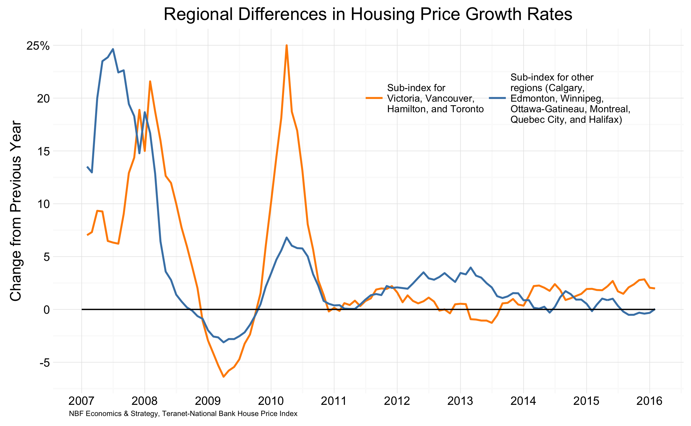
The above chart, created using data from Teranet-National Bank House Price Index, shows the difference in Canadian housing markets. Toronto and Vancouver area housing markets are continuing to increase, while other markets such as Halifax, Edmonton, and Winnipeg are seeing decreases. The growth (or lack thereof) in housing markets may be linked with recent mortgage rules meant to keep the housing market from overheating. These rules meant increases to down payments for consumers purchasing home over $500,000. Thus, in the time preceding the implementation of these rules short surges to housing markets were expected, as buyers attempted to avoid higher down payments.
The Reflection
Creating this graph required a lot of reading and looking at data to understand what the original graph was presenting. While we were unable to replicate the results, we were able to come close. I am very happy with this, considering we were unsure what the original graph was presenting and were unable to replicate the values they were presenting. I am also pleased with my group’s ability to increase the clarity and simplicity of this visualization.
One thing I would have liked to include was the highlighted section presented in the original graph. We were unable to understand what the highlighting meant, and thus opted not to include it. However, if we had found what story it was helping to tell, I would like to include that and highlight relevant pieces within the visualization.
The Process
This plot was also created as part of the data visualization review assignment. Thus, similarly to the article review, my group and I spend a lot of time attempting to understand what this graph was conveying. While the news article the original visualization (shown below) was published in did not contain the dataset used to create the graph, we were able to find it by following the small caption on the original graph. This historic national composite price index dataset can be downloaded from Teranet-National Bank’s website. Before we were able to create a plot for this data, we first needed to understand what the original was displaying. While we were unable to find statistic which matched the original, we found that a percent change from the previous year created a similar distribution.
To prepare our data for plotting we needed to convert and summarize values in the groupings present in the original plot. Further, we did general tidying and modifying to get a long rather than wide dataset. Once this was finished we plotted the data using a line graph. We chose to have the same lines as the original graph, but didn’t include the shaded area in this graph. We also worked at simplifying the graph, removing unnecessary grid lines, axis titles, and plot fills.
The Learning
The first task in recreating this graph was to understand the message the original was trying to communicate. Unfortunately, this was much easier said than done. Elements such as poorly labeled axis, mysterious shaded areas, and the lack of an accompanying story made this graph very hard to understand. After finding these detail-focused problems in the original graph, our group then attempted to provide remedies. This process had us realize the importance of small details in graph design. Decisions such as where to place legends, how to explain annotations, or how to best label the axes are important for communication. The creation of this graph taught be that the details can not be overlooked, especially when communicating a complex story.
library(foreign)
library(dplyr)
library(ggplot2)
library(reshape2)

house <- read.csv("/Users/.../hpi_3-23-2016.csv")

# Get the data ready to use
house1 <- house %>%
  # Split month from year
  mutate(month = substring(Transaction.Date, 0, 3)) %>%
  mutate(year = substring(Transaction.Date, 5,8)) %>%
  # Adjust timeframe to article's
  filter(year >= 2006) %>%
  # Change values to numeric & summarise into one group
  mutate(ON_Hamilton = as.numeric(ON_Hamilton)) %>%
  mutate(ON_Toronto = as.numeric(ON_Toronto)) %>%
  mutate(BC_Victoria = as.numeric(BC_Victoria)) %>%
  mutate(BC_Vancouver= as.numeric(BC_Vancouver)) %>%
  group_by(year, month) %>%
  mutate(TVVH = sum(ON_Toronto, ON_Toronto, BC_Victoria, BC_Vancouver)) %>%
  # Change values to numeric & summarise into another group
  mutate(AB_Calgary = as.numeric(AB_Calgary)) %>%
  mutate(AB_EDMONTON = as.numeric(AB_EDMONTON)) %>%
  mutate(MB_Winnipeg = as.numeric(MB_Winnipeg)) %>%
  mutate(X_Ottawa_Gatineau = as.numeric(X_Ottawa_Gatineau)) %>%
  mutate(QC_Montreal = as.numeric(QC_Montreal)) %>%
  mutate(QC_Québec = as.numeric(QC_Québec)) %>%
  mutate(NS_Halifax = as.numeric(NS_Halifax)) %>%
  mutate(CEWOMQH = AB_Calgary + AB_EDMONTON + MB_Winnipeg +
          X_Ottawa_Gatineau + QC_Montreal + QC_Québec + NS_Halifax) %>%
  # Tidy the dataset up a bit, get ready to find calculations
  select(month, year, TVVH, CEWOMQH) %>%
  melt(id = c("month", "year")) %>%
  group_by(variable) %>%
  mutate(yrprev = lag(value, n=12, default = NA)) %>%
  # Find the change in index from previous year
  mutate(yby = (value - yrprev)/yrprev*10) %>%
  mutate(date = as.Date(paste(1,month,year), "%d %b %Y")) %>%
  filter(date >= as.Date("2007-02-01"))


# Plot the new graph
ggplot(house1, aes(x=date, y=yby, colour = variable)) +
  theme_minimal() +
  geom_line(size=0.75) +
  ggtitle("Regional Differences in Housing Price Growth Rates") +
  scale_color_manual(values=c("darkorange","steelblue"),
                     labels=c("Sub-index for \nVictoria,
                              Vancouver,\nHamilton, and Toronto",
                              "Sub-index for other\nregions
                              (Calgary,\nEdmonton, Winnipeg,
                              \nOttawa-Gatineau, Montreal,
                              \nQuebec City, and Halifax)")) +
  theme(legend.title=element_blank(),
        legend.text=element_text(size=8),
        legend.direction="horizontal",
        legend.position = c(0.7,0.81)) +
  annotate("segment", y=0, yend=0,
           x=as.Date("2007-01-01"),
           xend=as.Date("2016-02-01")) +
  labs(y="Change from Previous Year",
       x="NBF Economics & Strategy,
       Teranet-National Bank House Price Index") +
  theme(axis.title.x = element_text(size=6,
                                    hjust=0.04)) +
  scale_y_continuous(breaks=c(-10,-5,0,5,
                              10,15,20,25),
                     labels=c("-10","-5","0","5",
                              "10","15","20","25%")) +
  scale_x_date(breaks=c(as.Date("2007-01-01"),
                        as.Date("2008-01-01"),
                        as.Date("2009-01-01"),
                        as.Date("2010-01-01"),
                        as.Date("2011-01-01"),
                        as.Date("2012-01-01"),
                        as.Date("2013-01-01"),
                        as.Date("2014-01-01"),
                        as.Date("2015-01-01"),
                        as.Date("2016-01-01")),
               labels=c("2007", "2008", "2009",
                        "2010", "2011", "2012",
                        "2013", "2014", "2015", "2016"))