Data Visualization
The Story
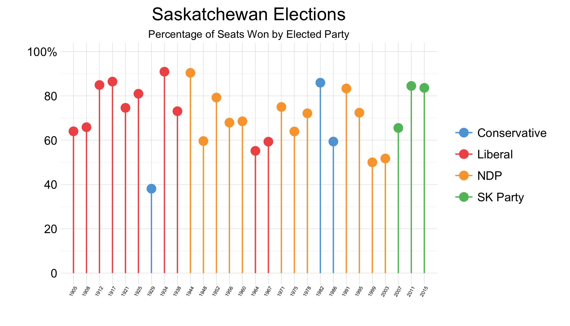
Saskatchewan’s 28th provincial general election was recently held on April 4th, 2016. Over 400,000 votes were cast in the election, meaning an almost 58% voter turnout. Brad Wall’s Saskatchewan Party, the conservative party which had governing the province from 2007, won 51 of the 61 seats commanding over 62% of the popular vote. This was a near record breaking achievement for the Saskatchewan party.
Despite the current popularity and dominance of the Saskatchewan Party, the political history and governance of Saskatchewan is diverse. As shown in the graph above, we can see early legislature was dominated by the Liberal party, with only one government falling to the Conservative party. Then, with the struggles of the Great Depression and dust bowl of the 1930s the NDP predecessors were born and commanded government. More recently, there has been a more diverse political landscape with three parties governing legislature during the pas 30 years.
However, despite the changing governments and trends, it is interesting to note there has only ever been two minority governments in the history of the province. This is an interesting contrast to the federal government, where three governments since 2004 have been minorities. Perhaps this is typical of elections in smaller geographic areas, where a larger portion of voters share common experiences, hardships, and general opinions.
The Reflection
I am very happy with how this graph turned out. I am especially happy with my choice to use a variation of the Cleveland dot plot. I believe it suits this instance well, presenting a large number of data points in a manner which does not overwhelm the viewer. I believe this is a much better alternative to a bar chart.
However, one thing I would like to add to this graph is a reference line/axis at 50%. I believe this would provide context for discussion, especially that surrounding the large number of majority governments in Saskatchewan’s history.
The Process
To begin the creation of this graph, I needed to first collect the data. I was able to find the historic Saskatchewan election results from its Wikipedia page1. I was able to verify these summarized results using a recent Canadian press article on Saskatchewan elections2. This data was compiled into a csv file, which included each election, the total number of seats up for grabs during that election, and the number of seats won by the elected party.
Once the dataset was imported to RStudio, I quickly found the percentage of the total seats won by the elected party. After this, I was ready to graph the data. After conducting some research and considering many of the core tenets of Stephen Few’s book, I decided to implement a version of a Cleveland dot plot. This was done to maximize the ability to compare values and note trends without overwhelming the visitor. I plotted each value and then added a line segment connecting to the axis. I felt this was useful considering the large number of data points presented in the visualization. Each of these point/line segment groupings were coloured according to the election’s winning party. After this, I was able to finish the plot off with other design details such as where to place labels on axes and developing a suitable title for the plot.
The Learning
This was my first attempted at creating a variation on a Cleveland dot. While I had seen them prior to this course, I had not realized they were a specific type of graph, nor had I understood their benefits. After conducting some research on Cleveland dot plots, and reading about their implementation I feel comfortable knowing when and how to implement them.
I chose to use a Cleveland dot plot for this visualization as it provided viewers with the ability to accurately obtain values from the graph. Further, I felt a bar graph for this dataset may have been especially overwhelming for the viewer. Additionally, creating this visualization had me learn about useful functions in ggplot, such as how to aes() within geom functions such as geom_segment.
Having the knowledge necessary to understand which visualization type to use to best communicate a message is important and has allowed me to improve my communication of data.
library(foreign)
library(dplyr)
library(ggplot2)

sk_elections <- read.csv("/Users/.../SK_Elections.csv")

winner_perc <- sk_elections %>%
  mutate(percent = Winner.Seats/Seats*100)
View(winner_perc)

ggplot(winner_perc, aes(x=factor(Year),
                        y=percent,
                        colour=Winner)) +
  geom_point(size = 3) +
  geom_segment(aes(xend=factor(Year)), yend=0) +
  theme_minimal() +
  ggtitle("Saskatchewan Elections") +
  annotate("rect", xmin=0, xmax=29,
           ymin=104, ymax=112, fill="white") +
  annotate("text", x=14.5, y=108,
           label="Percentage of Seats Won by Elected Party",
           size = 3 ) +
  scale_x_discrete(name="") +
  scale_y_continuous(name = "",
                     breaks= c(0, 20, 40, 60, 80, 100),
                     labels= c("0", "20", "40",
                               "60", "80", "100%")) +
  scale_color_manual(name = "",
                     values = c("#5DA5DA", "#F15854",
                                "#FAA43A", "#60BD68")) +
  theme(axis.text.x = element_text(angle=60, hjust=0.9,
                                   vjust=1.1, size=4)) +
  coord_cartesian(ylim=c(0, 105))
Footnotes
-
List of Saskatchewan general elections. (April 19, 2016.). In Wikipedia. Retrieved from: https://en.wikipedia.org/wiki/List_of_Saskatchewan_general_elections ↩
-
Saskatchewan Party wins again: Here is a look at past provincial election results. (2016, April 4). The Canadian Press. Retrieved from http://www.metronews.ca/news/canada/2016/04/04/saskatchewan-party-wins-again-here-is-a-look-at-past-provincial-election-results.html ↩