Data Visualization
The Story
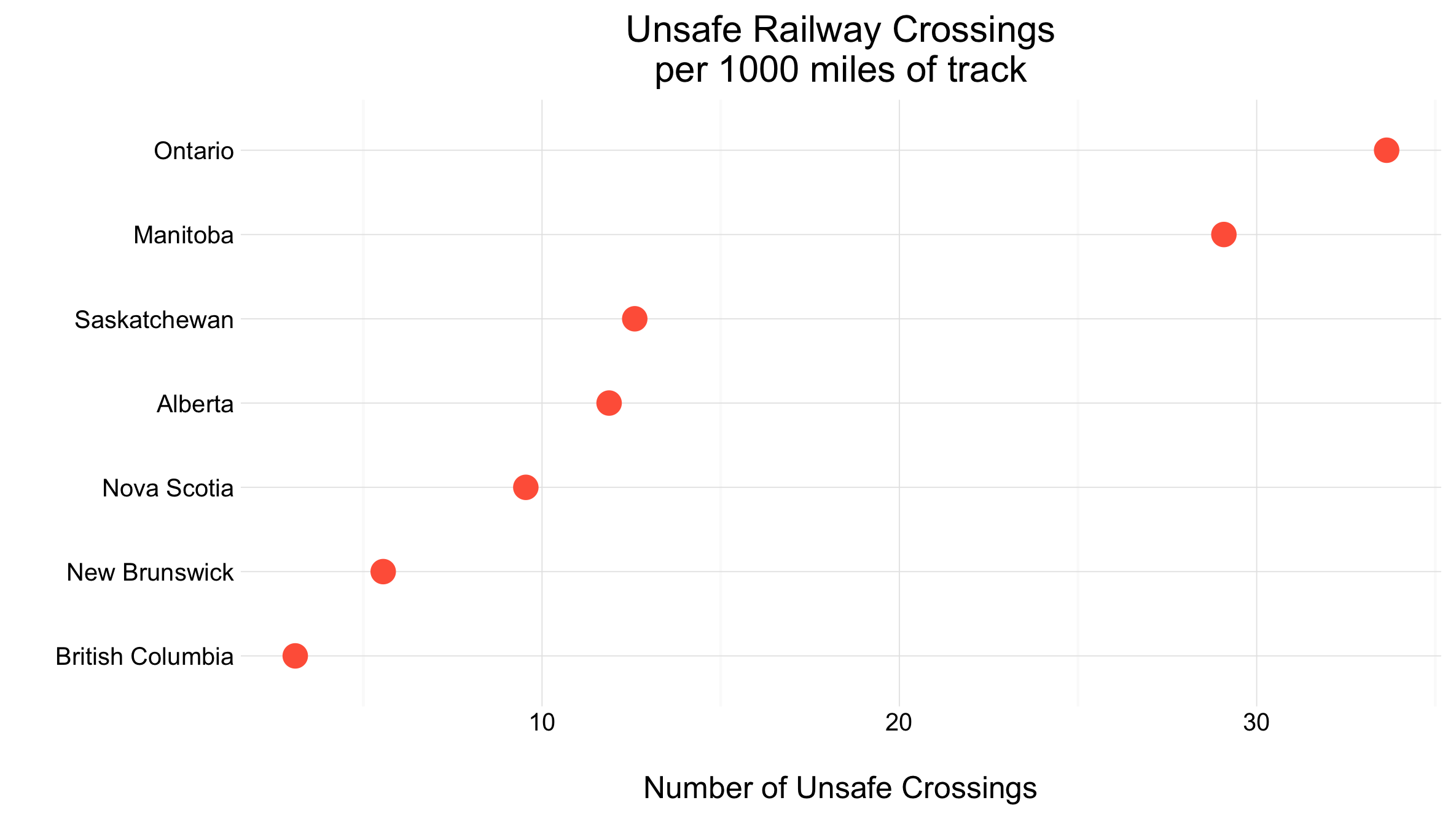
CBC news recently conducted an investigation into Transport Canada’s list of Canada’s 500 most dangerous railway crossings1. Of these, Ontario had the most with over 222 dangerous crossings in Canada. Manitoba and Saskatchewan were the next to follow with 83 and 63 respectively. While the difference between the number of dangerous crossings in Ontario and other provinces may seem extreme, we should also consider the amount of rail lines within the province.
As shown in the visualization above, Ontario still has the highest ration of unsafe crossings per 1000 miles of track, but Manitoba is close behind. Perhaps one of the reasons Ontario has such a high proportion of unsafe crossings is because of its densely populated southern region. This may mean there are more frequent crossings of railroad tracks in urban centres, making them more prone to danger. None the less, the provinces, especially those on the right side of this graph, should begin to address the danger of these crossings. This has become especially pertinent with recent fatalities on some of these dangerous crossings.
The Reflection
One reason I really like the graph is its simplicity. It is able to convey information clearly without distraction. I am also happy I chose to normalize the data in some way, accounting for differences in provinces’ railways before creating a comparison. I am glad I took the time to understand the data before simply plotting it. Had I not done this, I easily may have missed this step. I also was glad I was able to visualize an incredibly timely dataset, which recently made national news headlines.
One thing I don’t like about this graph is it doesn’t do a sufficient job indicating which provinces are performing well or poorly. I would like there to be an element included to show a statistic such as the national average, or perhaps a point at which the number of unsafe railway crossings is cause for alarm in a province.
The Process
To begin developing this graph I needed to collect the data. The first dataset was found on a recent CBC article discussing the most dangerous railway crossings in Canada1. This dataset contained information on 500 railway crossings throughout Canada, including location, which railway it was located on, and whether it was under federal, provincial, or municipal jurisdiction. The google sheets document containing this dataset can be viewed here. The second set of data was collected from a 2014 detailed profile of rail in Canadian provinces 2. This dataset can be downloaded at railcan.ca. The data found in this workbook was manually compiled into a csv file.
Once each of these datasets were established I was able to merge them on “Province” to create one table. I then selected the columns I was most interested in working with. I was then able to determine the number of dangerous crossings in each province, and divide this by the number of operational miles of railway track in each. This provided me with the number of dangerous railway crossings each province had for every 1000 miles of track.
After this was done, I was able to plot the results. I chose to show this data in a Cleveland dot plot, as I wanted to present the data in a simple manner, easy for anyone to interpret. This meant little additional work was needed to create the plot. The most important tasks for this plot was to ensure the Provinces were labelled correctly, and the title was clear. Further, I needed to ensure the point colour and size were appropriate for the visualization.
The Learning
I used two separate datasets to create this visualization. Initial explorations only used the e unsafe railway crossing list recently compiled by Transport Canada. Using this I was able to find the number of unsafe crossings in each province. However, I felt this was an unfair comparison between provinces, which didn’t account for the number of crossings in the province. For example, if a province had 15 unsafe crossings but only 15 crossings, surely this is much worse than a province with 50 unsafe crossings with 500 total crossings. While I was unable to find the total number of crossings, I was able to find the miles of operational track in each province. This offered some ability to normalize the statistics and more accurately compare the values.
I believe process and decision demonstrates a one of the key realizations I have had during this course: Data is everywhere. I found the original unsafe crossing list while reading a CBC article in mid-April. While it wasn’t explicitly presented in the article, a link was provided to the google sheets file where the data was presented. Prior to this course, I had not realized researchers, citizens, and government organizations have published such vast quantities of data. I am now comfortable going forward and searching for data, as demonstrated by finding the track miles in each province.
# Setting up the Data Set
library(foreign)
library(dplyr)
library(ggplot2)


plain_crossings <- read.csv("/Users/...")

track_length <- read.csv("/Users/...Track_Length.csv")

crossings <- merge(plain_crossings, track_length, by="Province") %>%
  select(RWY, Province, Region, Track..miles.) %>%
  rename(Track_miles = Track..miles.) %>%
  group_by(Province, Track_miles) %>%
  summarise(count = n()) %>%
  mutate(Track_miles = Track_miles/1000) %>% # Makes it dangers per 1000 miles
  mutate(dangerbymiles = count/as.numeric(Track_miles))


ggplot(crossings, aes(x=reorder(Province, dangerbymiles), y=dangerbymiles)) +
  geom_point(colour = "tomato", size=4) +
  theme_minimal() +
  coord_flip() +
  ggtitle("Unsafe Railway Crossings\nper 1000 miles of track") +
  scale_x_discrete(name="",
                   breaks = c("ON", "MB", "SK",
                              "AB", "NS", "NB", "BC"),
                   labels = c("Ontario", "Manitoba",
                              "Saskatchewan", "Alberta",
                              "Nova Scotia", "New Brunswick",
                              "British Columbia")) +
  scale_y_continuous(name = "\nNumber of Unsafe Crossings")
Footnotes:
-
Marcoux, J., Moore, H., McDonald, J., & Seglins, D. (2016, April 13). Transport Canada list of 500 “highest risk” railway crossings not widely shared. CBC News. Retrieved from http://www.cbc.ca/news/canada/manitoba/high-risk-rail-crossings-1.3530315 ↩ ↩2
-
Rail Canada. (2014). Detailed Profile of Rail by Province. Retrieved from http://www.railcan.ca/economy/provinces ↩