Data Visualization
The Story
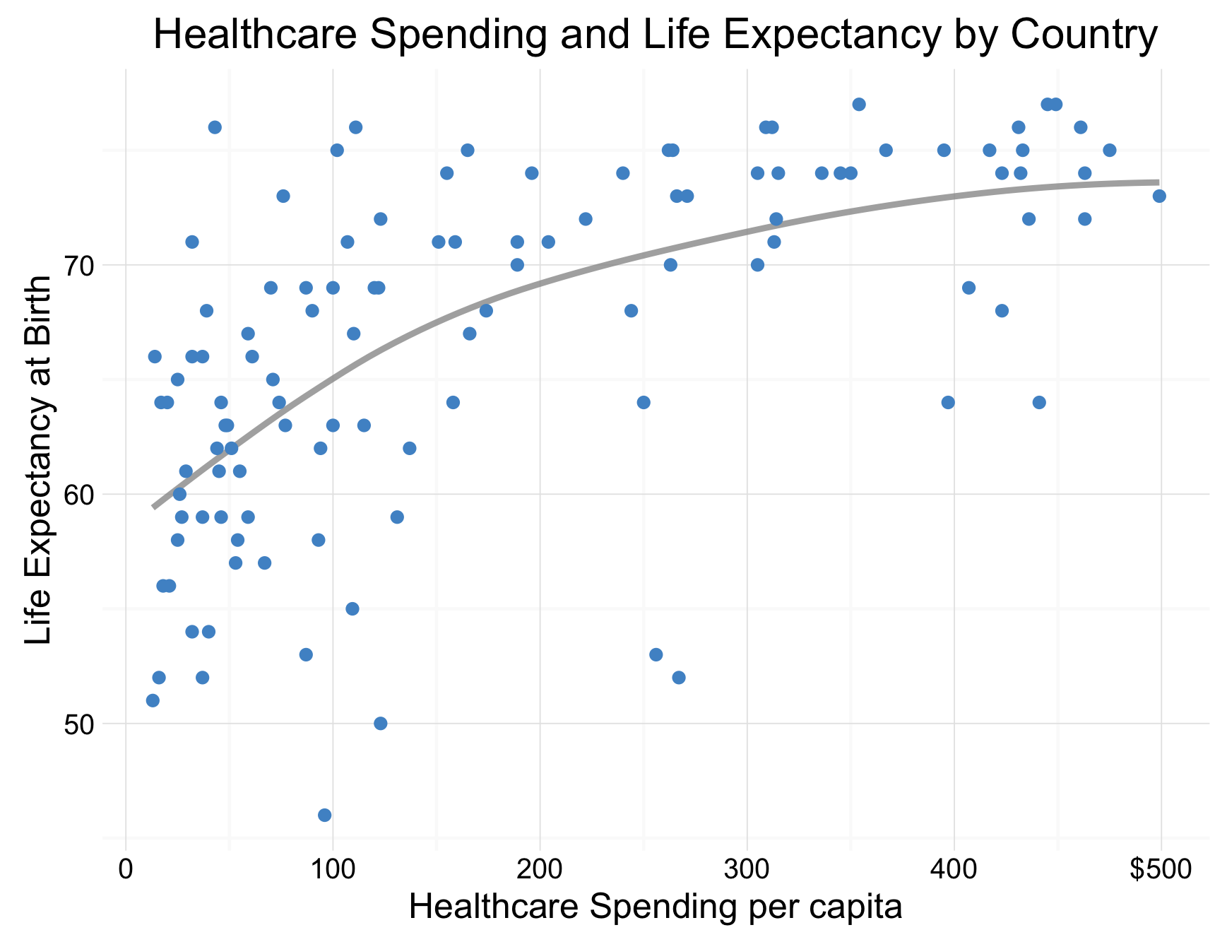
Intuitively we may believe that as a country increases its healthcare spending per capita it is natural to also see an increase in life expectancy. The positive correlation between these two statistics is shown on the graph above. This plot highlights the relationship between these two variables for countries which spend less than $500 per person on healthcare. The trend line shows how differences of less than $500 correspond to an improved life expectancy of nearly 15 years. That is less than $35 per year of life after the age of 60, a seemingly reasonable amount for a country to provide. This trend is very interesting, and perhaps indicates how increases in healthcare services (thus increases in spending) for countries who spend relatively little on healthcare, may correspond to major improvements for life expectancy. However, we must also consider other reasons for this relationship. Perhaps country’s with higher life expectancies naturally have increases to their healthcare expenditures as people tend to need more intense and frequent healthcare later in their lives. No matter the reason for this relationship, it is a topic which should be investigated, and perhaps those countries which substantially deviate from the norm, should be investigated to see why these differences appear.
The Reflection
For this graph, I was pleased with my ability to filter through the large number of data points, overcoming over plotting to focus on a meaningful story. The process of parsing the data to find these stories was very fruitful and eventually resulted in multiple possible stories (as discussed in “The Learning” section). However, I am glad with my final decision to focus on this particular story. Further, I am glad with my decision to include the trend line, as I believe it confirms the trend you can see visually, and summarizes it well for the audience. I believe this is an important visual, as it helps provide a reference point for discussion.
However, there are a couple changes I would like to see in this graph. For instance, I wish I had found a way to identify and label anomalous countries. I believe this would have helped facilitate an even more interesting discussion regarding why countries may deviate from the observed trend, and what that might mean. Also, as I have reflected on this graph, I realize there isn’t actually anything indicating what the labels represent. In this case, they could represent anything from countries, to cities, or perhaps even people.
The Process
The datasets for this graph were obtained from the Global Health Observatory’s online data repository. The first dataset contained life expectancy by country 1 while the second detailed healthcare expenditure per capita by country 2. Once I had each of these datasets downloaded, I made some quick adjustments to column names and then merged them on the country column. Then I was able to select the specific columns I was interested in.
After this I plotted a graph of life expectancy by spending. I found there was a logarithmic trend for the values, where spending up to roughly 500 dollars saw a large increase in life expectancy, but afterwards there was a flattening out of the trend. I experimented with different visualizations, considering whether to implement a log-log graph, or simply focus on one area of the plot. Eventually I decided I wanted to focus on countries which spend under $500 on healthcare, and their life expectancy trends. To do this, I went back to my data and filtered out any countries which spend $500 or more per capita on healthcare.
Once this was completed, I was pretty well done my visualization. While previously I had only created a scatterplot, I chose to also add a trend line to the visualization. Further, I changed colours, axis labelling and breaks, and the title for the graphs. I also attempted to incorporate labels for the graph, so readers could identify individual countries. However, since the points were so densely plotted, I was unable to do in a sufficient manner.
The Learning
When I began to create exploratory graphs for the WHO data, I soon became overwhelmed with the number of data points I was presented with. These data points were densely populated, following a logarithmic trend. From these visualizations I realized there were multiple stories worth telling with this data. Firstly, it seemed as though after a certain amount of spending, any increases had no impact on life expectancy. Secondly, I could choose to highlight the seemingly logarithmic trend in the data. Finally, I could choose to focus on how important the first $500 of healthcare spending is on life expectancy.
This was the first time I truly needed to choose which distinct stories I would tell with my visualization. Understanding that data can tell many different stories and that visualizations should improve the communication of these stories is an important concept I have learned from this course. I am glad I had the opportunity to use this concept first hand in the development of this visualization.
library(foreign)
library(dplyr)
library(ggplot2)

whospending <- read.csv("/Users/.../xmart_spending.csv")

wholife <- read.csv("/Users/.../xmart_life.csv")

spending <- whospending %>%
  rename(Spending = X2013)

life <- wholife %>%
  filter(Year == 2013)

who <- merge(spending, life, by = "Country") %>%
  select(Country, Spending, Both.sexes) %>%
  filter(Spending < 500) %>%
  mutate(Country = as.character(Country))

# Special Points: Syrian Arab Republic

ggplot(who, aes(x=Spending, y=Both.sexes)) +
  geom_smooth(se=FALSE, colour = adjustcolor(col="grey60", alpha.f=0.8)) +
  geom_point(colour="steelblue3") +
  ggtitle("Healthcare Spending and Life Expectancy by Country") +
  theme_minimal() +
  scale_y_continuous(name = "Life Expectancy at Birth") +
  scale_x_continuous(name = "Healthcare Spending per capita",
                     labels = c("0", "100", "200", "300", "400", "$500"))
Footnotes
-
Global Health Observatory. (2013). Life Expectancy by Country [Dataset]. Retrieved from http://apps.who.int/gho/data/node.main.688?lang=en ↩
-
Global Health Observatory. (2013). Health expenditure per capita, all countries, selected years estimates by country [Dataset]. http://apps.who.int/gho/data/node.main.78?lang=en ↩